
What we have seen in Shopify audits is this: product comparison is often treated as a nice extra, when it is actually one of the highest-intent parts of an ecommerce journey. Customers do not only ask “which product is cheapest?” They ask which size, bundle, material, formula, plan, version, model, subscription, or accessory is right for their situation.
UK Shopify agency content, including Charle’s ecommerce and Shopify guides, shows strong demand around CRO, segmentation, SEO, mobile optimisation, and product-page improvement. StoreBuilt’s angle is narrower: comparison pages can turn that demand into a practical structure that helps shoppers decide faster without overloading product pages.
If your Shopify store has a catalogue where customers need help choosing, Contact StoreBuilt for a product discovery and comparison audit.
Table of contents
- Keyword decision and research inputs
- Why comparison pages matter in the UK ecommerce market
- The comparison page types worth building
- A Shopify comparison page structure
- Implementation table
- An anonymous StoreBuilt example
- StoreBuilt point of view
Keyword decision and research inputs
| Decision | Direction |
|---|---|
| Primary keyword | ecommerce product comparison |
| Secondary keywords | Shopify comparison pages, ecommerce UK market, Shopify CRO, ecommerce SEO, product comparison UX |
| Search intent | Learn how to help ecommerce shoppers compare similar products before purchase |
| Funnel stage | Middle to bottom |
| Page type | Practical Shopify UX and SEO playbook |
| Why StoreBuilt can win | StoreBuilt works across Shopify product data, collections, UX, SEO, and CRO, which all affect comparison quality |
Research inputs included current SERP patterns around ecommerce comparison pages and Shopify CRO, Charle’s article hub topics around CRO, segmentation, mobile SEO, and Shopify growth, Shopify’s official guidance around product organisation and storefront content, and a local duplicate-risk pass across StoreBuilt’s existing product data, collection architecture, AI shopping, search, and category UX articles.
Why comparison pages matter in the UK ecommerce market
The UK ecommerce market is crowded. Paid acquisition is expensive, organic results are competitive, and shoppers often compare products across marketplaces, brand websites, review sites, TikTok, Google Shopping, and AI search answers before buying. A Shopify store that does not help customers compare can end up sending them back to Google to finish the decision elsewhere.
Comparison content is not only for electronics or enterprise software. It matters for skincare routines, supplements, homeware sizes, flooring samples, subscription plans, coffee formats, gifting tiers, fashion fits, spare parts, furniture materials, and B2B reorder choices.
The issue is that many Shopify stores place all decision support onto product pages. That creates crowded PDPs: badges, reviews, size guides, ingredient notes, delivery panels, FAQs, upsells, cross-sells, and subscriptions all compete for attention. A comparison page gives the brand a cleaner place to explain trade-offs.
For SEO, comparison pages also capture intent that category and product pages do not always satisfy. A collection page usually says “buy these products”. A comparison page says “which of these products should I choose?” That difference matters because the searcher is still evaluating, not simply filtering.
The comparison page types worth building
The strongest comparison pages are tied to real buying friction. Do not build them because a competitor has them. Build them where support tickets, site search terms, returns reasons, reviews, or sales calls show that customers are uncertain.
Product versus product
This is useful when two or three hero products look similar. It works well for supplements, beauty devices, technical accessories, coffee machines, footwear, luggage, skincare products, and furniture ranges.
The page should not pretend every product is equally suitable. It should make the trade-off clear: best for beginners, best for sensitive skin, best for small spaces, best for heavy use, best for gifting, best for repeat purchase, best for trade buyers.
Range or collection comparison
Some shoppers need help choosing between ranges rather than SKUs. For example, a home brand may need to explain different furniture collections. A food brand may need to compare hamper tiers. A wellness brand may need to compare routine types.
Range comparison can support SEO because it lets the brand target broader buying-guide queries without turning a collection page into an essay.
Plan or bundle comparison
Subscriptions, bundles, kits, and starter packs need clear comparison. The risk is discount-led messaging that hides margin problems. A better comparison page explains what each option includes, who it suits, how often it replenishes, and where value comes from.
Alternative and replacement pages
For high-SKU or parts-led brands, customers often search for alternatives, replacement parts, compatible accessories, or newer models. Shopify can support this with collections, metaobjects, metafields, and structured internal links, but the content model needs planning.
A Shopify comparison page structure
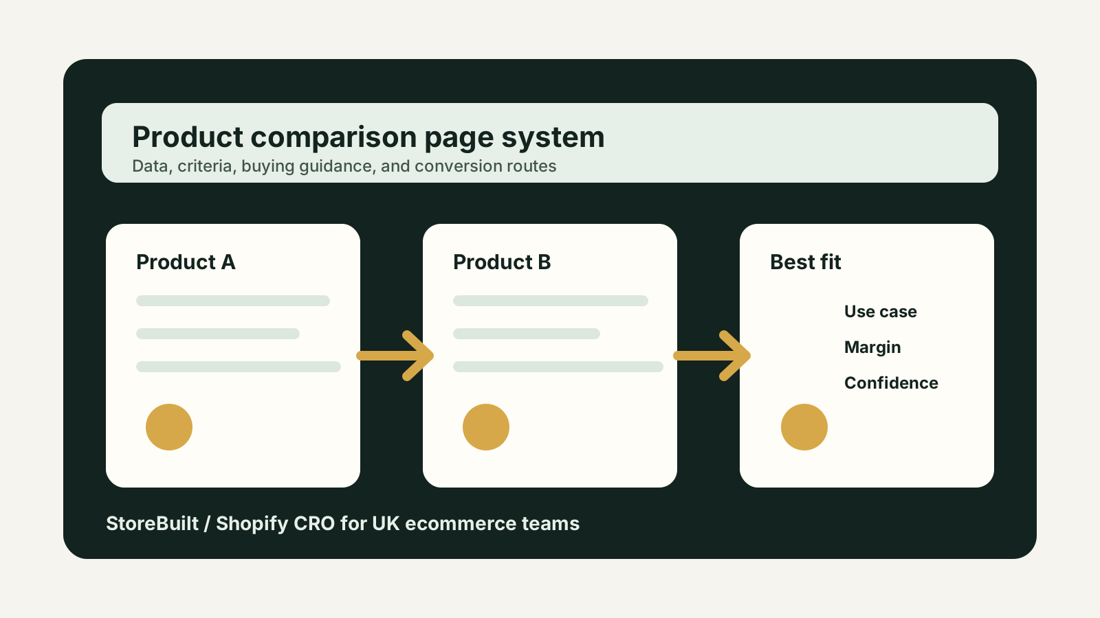
Start with a plain answer. A shopper should quickly understand which product is best for which situation. Avoid opening with brand history or generic category copy.
Next, show a comparison table. Keep the table short enough to scan on mobile. If the table needs 18 rows, split it into sections or use progressive disclosure. The most important fields are usually use case, fit, price range, delivery or stock caveats, compatibility, ingredients or materials, subscription suitability, warranty, returns risk, and who should avoid it.
Then add buying guidance. This is where StoreBuilt often sees the biggest gap. A table says what differs; guidance explains why it matters. For example, a material may be more durable but less suitable for outdoor use. A supplement may be stronger but less suitable for first-time buyers. A large furniture item may be better value but harder to deliver.
After that, add product cards or collection routes. Do not make the comparison page a dead-end article. Link to the relevant products, collection, buying guide, and service or support content.
For Shopify SEO, make sure the page has one clear primary query, descriptive headings, internal links from related collections, and product data consistency. If the same attribute is described differently across PDPs, filters, feeds, and comparison pages, search engines and customers get mixed signals.
StoreBuilt’s Shopify SEO and AI search readiness service is often the right route when comparison content depends on better product data, taxonomy, schema, and internal linking.
Implementation table
| Component | Shopify implementation | Why it matters |
|---|---|---|
| Comparison criteria | Metafields or metaobjects for structured attributes | Keeps content consistent across PDPs, collections, feeds, and guides |
| Page template | Theme section or reusable landing template | Lets ecommerce teams create future comparisons without developer dependency |
| Product cards | Dynamic product references where possible | Reduces stale pricing, availability, and product-link errors |
| Internal links | Collection, PDP, guide, and support links | Helps shoppers continue the journey and supports crawl paths |
| Mobile table | Responsive card layout or short comparison grid | Prevents comparison content becoming unusable on phones |
| Measurement | Events for product clicks, scroll depth, and assisted conversion | Shows whether the page helps decision-making or only attracts traffic |
What to avoid
Do not copy manufacturer descriptions into comparison rows. They rarely answer the customer’s real question. Do not over-optimise for “best” if the page cannot justify the recommendation. Do not create comparison pages for every tiny variant if filters would solve the issue more cleanly.
Also avoid building comparison pages that compete with your main commercial pages. If the searcher wants to hire a Shopify agency, StoreBuilt’s homepage or service pages should own that intent. Blog comparison content should support the journey with specific buyer education, not cannibalise the homepage.
An anonymous StoreBuilt example
In one Shopify review, a brand had a strong product range but customers kept using onsite search to compare similar items. The PDPs were detailed, but each page explained the product in isolation. Customers had to open multiple tabs, compare reviews manually, and guess which item matched their use case.
The practical fix was not a full redesign. We mapped the decision criteria, cleaned up product attributes, created a comparison content structure, and added clearer internal links from collection pages. The team could then answer “which one is right for me?” before shoppers left the site to research elsewhere.
High-intent AI search implementation layer
The AI-search version of this topic is not just “write more content”. A useful answer engine result needs a page that gives a direct answer, proves the claim, and shows the next operational step inside Shopify.
| Area | StoreBuilt implementation check |
|---|---|
| Primary intent | The page should map to ecommerce product comparison and one clear buyer or operator problem, not a vague traffic topic. |
| Shopify surface | Identify whether the work belongs on a collection, product page, theme section, checkout step, app workflow, email flow, or support process. |
| Proof | Add first-hand observations, product/category examples, screenshots, policy notes, review signals, or trustworthy external sources where they make the advice safer. |
| Internal route | Link the reader to the service most likely to solve the issue: Shopify SEO and AI search readiness. |
| Measurement | Check Search Console, analytics, assisted conversions, enquiry quality, and AI-response mentions after the update rather than judging success by pageviews alone. |
For this article, the useful research inputs are: StoreBuilt CRO audit patterns, analytics QA checks, Shopify theme constraints, and buyer-intent SERP patterns. StoreBuilt would prioritise technical SEO, collection architecture, Product schema, answer-first content, GEO, and Search Console monitoring before expanding into broader supporting content.
If this topic maps to a live store problem, review the related StoreBuilt service or Contact StoreBuilt with the store URL and the issue you want fixed.
StoreBuilt point of view
Comparison pages are not just SEO assets. They are decision infrastructure.
StoreBuilt’s view is that the best ecommerce comparison pages reduce hesitation without forcing a hard sell. They help shoppers understand trade-offs, choose confidently, and reach the right product or collection faster. For Shopify brands in the UK market, that can be the difference between traffic that browses and traffic that buys.
For a Shopify comparison-page roadmap, product data audit, or CRO review, Contact StoreBuilt.