
What we have seen in high-return categories is this: poor returns UX does not only create service cost after purchase. It weakens conversion before purchase because customers can feel uncertainty long before they click buy.
If your returns policy is technically available but commercially underperforming, Contact StoreBuilt.
Table of contents
- Keyword decision and research inputs
- What UK competitor content usually misses
- Why returns UX is a conversion layer, not only an operations layer
- Returns UX table for Shopify teams
- Where returns clarity should appear on the store
- How to reduce bad returns instead of hiding the policy
- StoreBuilt client example
- Final StoreBuilt point of view
Keyword decision and research inputs
Primary keyword: shopify returns ux
Secondary keywords:
- returns experience shopify
- ecommerce UK market returns policy UX
- shopify returns conversion optimisation
- reducing returns on shopify
- returns messaging for ecommerce brands
Search intent: practical and commercial. The reader wants to improve return-related confidence without making the store feel defensive or difficult.
Funnel stage: middle.
Page type: CRO and customer-experience guide.
Why StoreBuilt can win this topic:
- We see returns issues through both pre-purchase UX and post-purchase operations.
- We regularly assess PDPs, checkout trust layers, and policy communication together rather than in isolation.
- We can explain how returns UX affects conversion quality, support load, and margin at the same time.
Research inputs used on June 15, 2026:
- SERP checks around Shopify returns, returns UX, returns policy optimisation, and conversion-focused ecommerce returns content.
- Public UK competitor-content review, including long-form editorial patterns common in Charle-style practical strategy articles.
- StoreBuilt observations from customer-journey audits, PDP reviews, and Shopify CRO work across fit-sensitive and expectation-sensitive categories.
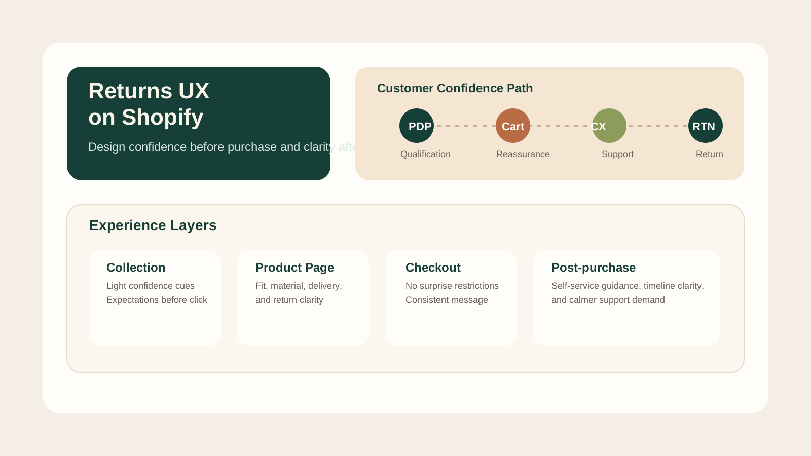
What UK competitor content usually misses
There is no shortage of content about returns. Much of it is operational:
- how to define a policy
- how to process exchanges
- how to set time windows
- how to choose an app
That information is useful, but it often skips the UX layer that influences revenue much earlier. Many UK articles still treat returns as a support or legal page problem. In reality, customers build their confidence across the whole journey:
- on collection pages
- on product pages
- in delivery and fit messaging
- at checkout
- in post-purchase reassurance
The stronger competitor articles usually communicate policy clearly. The opportunity for StoreBuilt is to go further and show how returns experience changes conversion quality, average order behaviour, and customer trust before the order is even placed.
Why returns UX is a conversion layer, not only an operations layer
Customers do not read your returns policy only when they want to send something back. They use it as a trust signal before buying.
That matters especially in categories where uncertainty is naturally higher:
- fashion and fit-sensitive products
- beauty and skin-reactive categories
- furniture and bulky-delivery items
- gifting and personalised products
- products with strong quality or expectation risk
When returns UX is weak, customers often compensate in predictable ways:
- they abandon the session
- they buy only one item instead of a basket
- they over-rely on discount triggers
- they contact support before ordering
- they buy with lower confidence and return at higher rates later
This is why a strict returns policy and a clear returns experience are not the same thing. A brand can have reasonable policy rules and still communicate them poorly.
Returns UX table for Shopify teams
| Journey point | What the customer needs | Good UX pattern | Weak UX pattern |
|---|---|---|---|
| Collection page | Quick confidence before clickthrough | Clear promise cues for delivery, fit, or returns expectations where relevant | No reassurance until footer policy page |
| PDP | Specific risk-reduction detail | Sizing, material, shipping, and returns clarity near purchase decision | Generic policy link with no context |
| Cart | Low-friction reassurance | Calm summary of key promise terms | Sudden surprise detail late in the journey |
| Checkout | Final trust confirmation | Consistent messaging with delivery and support expectations | Messaging disappears at the most sensitive step |
| Post-purchase | Reassurance and self-service clarity | Confirmation email, help path, realistic timeline | Silence until the customer chases support |
If the experience changes tone from one surface to another, confidence drops. Consistency is part of good returns UX.
Where returns clarity should appear on the store
The answer is not “everywhere all the time.” The answer is in the places where uncertainty actually needs reducing.
On product pages
This is the most important layer.
Customers need confidence around:
- fit or specification clarity
- condition expectations
- personalisation exceptions
- delivery and handling realities
- return or exchange path if something is wrong
This does not mean dumping legal copy around the add-to-cart button. It means designing calm, relevant reassurance that helps customers self-qualify faster.
On collection and search paths
For some categories, lightweight reassurance can improve product exploration. Example: if a category has higher hesitation due to fit or choice complexity, confidence cues can help users click deeper with less doubt.
In cart and checkout-adjacent messaging
By this point, the customer should not be discovering surprising restrictions for the first time. Cart messaging should reinforce what has already been implied or stated earlier.
In transactional communication
After purchase, good returns UX becomes part of service design:
- order confirmation tone
- delivery expectation setting
- self-service help routing
- exchange or return guidance
This is where UX and operations finally meet. If they are misaligned, support cost rises quickly.
How to reduce bad returns instead of hiding the policy
Some teams respond to high returns by making the policy harder to notice. That usually solves the wrong problem.
The better approach is to reduce avoidable mismatch before the order.
Improve product qualification
Customers return products when the store fails to help them judge fit, scale, texture, or usage properly. Better photography, variant clarity, product comparison, and expectation setting often do more for return quality than policy tightening.
Separate good-friction from bad-friction
Good friction helps customers make a smarter choice. Bad friction makes the store feel evasive.
Examples of good friction:
- clear size guidance
- usage notes
- compatibility filters
- material and care clarity
Examples of bad friction:
- hidden return details
- inconsistent wording across pages
- policy pages that read like warnings rather than support
Review return reasons as UX signals
Return reasons should be treated as design evidence. If “not as expected” or “wrong size” is persistently high, the store is communicating badly somewhere upstream.
This is where StoreBuilt CRO and UX work usually becomes more valuable than simply changing policy language.
Practical returns metrics table
| Metric | What it helps reveal | Useful follow-up question |
|---|---|---|
| Return rate by product type | Which categories create expectation mismatch | Is the PDP doing enough qualification work? |
| Return reason distribution | Why customers feel the order failed | Which reason can be improved through UX? |
| Pre-purchase support contacts about delivery, fit, or returns | Where confidence is weak before checkout | Which page should answer this sooner? |
| Exchange versus refund ratio | Whether trust and product fit are recoverable | Can clearer guidance keep revenue in-system? |
| Conversion rate change after confidence-message updates | Whether reassurance design is helping | Did we reduce uncertainty without harming clarity? |
Returns work should not be judged only after goods come back. It should also be judged by whether fewer weak-fit orders happen in the first place.
StoreBuilt client example
One UK ecommerce team had a familiar problem: returns were creating margin pressure, but conversion teams were nervous about making the policy too prominent. The result was a compromised experience. Returns details were technically present, but customers had to work to understand them, and PDP confidence remained weak.
We reframed the issue as a customer-qualification problem rather than a policy-visibility problem. Product pages were clarified, reassurance hierarchy was improved, and the support path around order confidence became more coherent. The store did not become “returns-first.” It became easier to understand.
That change usually matters more than adding another policy widget.
High-intent AI search implementation layer
The AI-search version of this topic is not just “write more content”. A useful answer engine result needs a page that gives a direct answer, proves the claim, and shows the next operational step inside Shopify.
| Area | StoreBuilt implementation check |
|---|---|
| Primary intent | The page should map to returns and one clear buyer or operator problem, not a vague traffic topic. |
| Shopify surface | Identify whether the work belongs on a collection, product page, theme section, checkout step, app workflow, email flow, or support process. |
| Proof | Add first-hand observations, product/category examples, screenshots, policy notes, review signals, or trustworthy external sources where they make the advice safer. |
| Internal route | Link the reader to the service most likely to solve the issue: CRO and UX optimisation. |
| Measurement | Check Search Console, analytics, assisted conversions, enquiry quality, and AI-response mentions after the update rather than judging success by pageviews alone. |
For this article, the useful research inputs are: StoreBuilt CRO audit patterns, analytics QA checks, Shopify theme constraints, and buyer-intent SERP patterns. StoreBuilt would prioritise PDP hierarchy, cart friction, mobile merchandising, testing policy, analytics QA, and measured releases before expanding into broader supporting content.
If this topic maps to a live store problem, review the related StoreBuilt service or Contact StoreBuilt with the store URL and the issue you want fixed.
Final StoreBuilt point of view
On Shopify, returns UX is not a damage-control layer that starts after purchase. It is part of conversion design. The strongest UK ecommerce teams reduce avoidable returns by helping the right customers buy with more confidence in the first place.
If your returns content is hidden, inconsistent, or disconnected from product qualification, the store is asking customers to take unnecessary risk. Better returns UX does not mean being looser. It means being clearer, earlier, and more commercially intelligent.