
What we have seen in cart reviews is this: many Shopify brands add a cart drawer because it feels modern, then quietly accept lower clarity inside one of the most commercially sensitive moments in the journey. A cart drawer is not automatically better than a cart page. It is only better when it reduces friction and helps the customer keep moving.
If your basket UX is busy, unclear, or difficult to measure, Contact StoreBuilt.
Table of contents
- Keyword decision and research inputs
- Why the cart drawer matters more than teams think
- The cart drawer patterns that usually perform best
- When a full cart page is still the stronger choice
- Cart drawer review table for UK ecommerce teams
- StoreBuilt example
- What to test before shipping a new drawer
- Final StoreBuilt point of view
Keyword decision and research inputs
Primary keyword: shopify cart drawer
Secondary keywords:
- cart drawer patterns
- Shopify cart UX
- ecommerce cart drawer best practices
- Shopify drawer cart conversion
- ecommerce UK market cart UX
Search intent: practical and commercial. The reader is usually improving onsite conversion, reviewing theme behaviour, or deciding whether a drawer should replace or supplement a cart page.
Funnel stage: middle to bottom.
Page type: implementation guide with decision framework.
Why StoreBuilt can realistically win this topic:
- We review Shopify cart behaviour as part of CRO, UX, and support-retainer work rather than as an isolated design feature.
- Many articles treat the drawer as a trend item instead of a decision layer tied to AOV, trust, and mobile clarity.
- UK ecommerce teams usually need guidance on what to simplify, what to merchandise, and what to keep off the drawer entirely.
Research inputs used on June 18, 2026:
- Current SERP pattern review for
shopify cart drawer,cart drawer ux, and adjacent Shopify conversion queries. - Competitor content and insight patterns from Flux, Charle, Underwaterpistol, and adjacent UK Shopify agencies publishing on CRO and checkout optimisation.
- Official Shopify Help Center guidance showing cart-drawer settings at theme level and related storefront customisation behaviour.
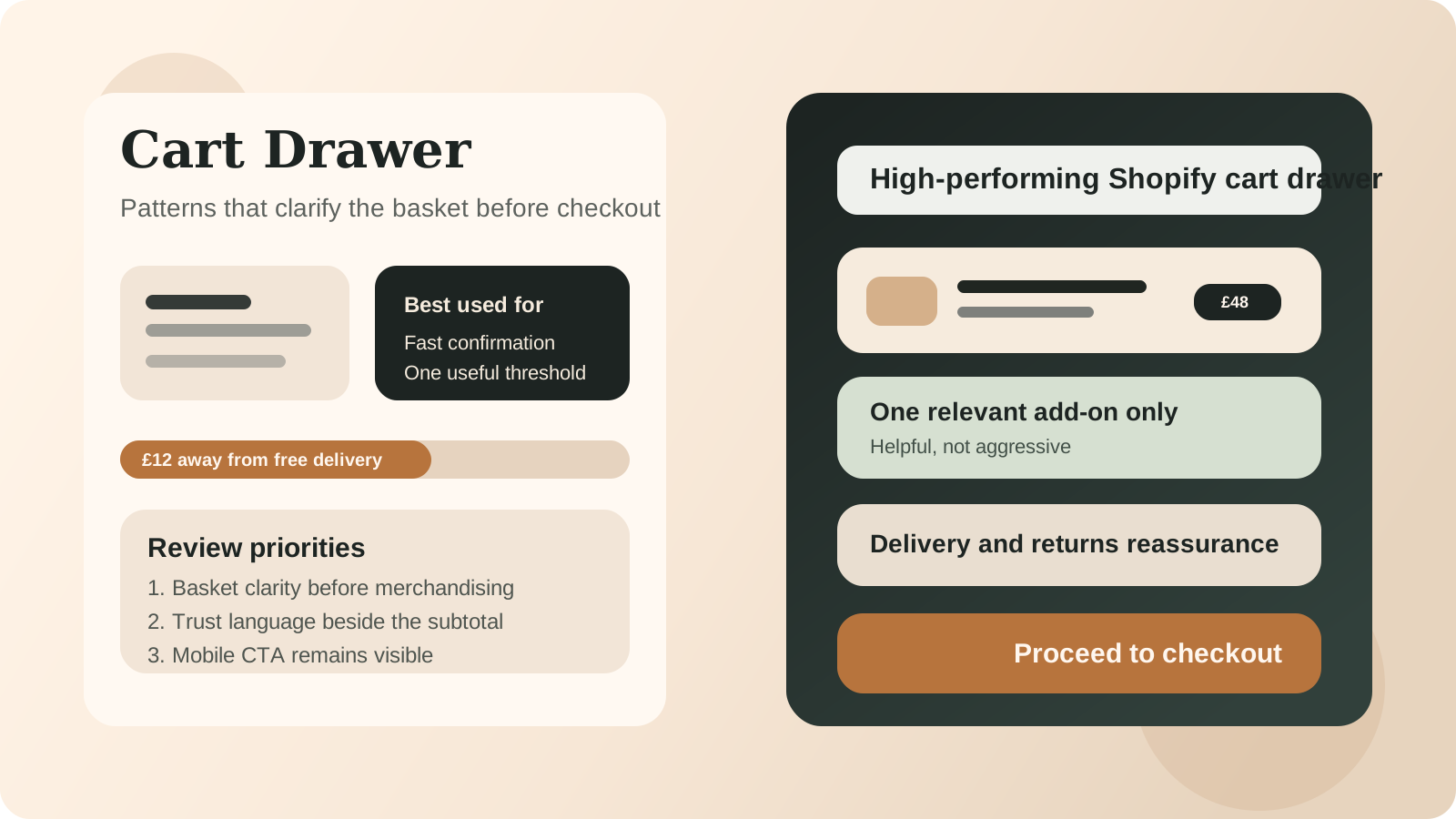
Why the cart drawer matters more than teams think
The cart drawer sits in a deceptively important position.
It is often the first time the customer pauses to check whether the promise made on the product page still feels true when money is about to move.
At this point, the drawer is doing several jobs at once:
- confirming the right item, variant, and quantity were added
- reducing anxiety around delivery cost or delivery speed
- showing whether promotional logic behaves as expected
- creating a small, useful chance to increase basket quality
- moving the customer into checkout with as little hesitation as possible
That is why weak cart drawers hurt twice. They can lower conversion and still fail to increase AOV.
In the ecommerce UK market, where mobile usage is high and trust sensitivity around delivery cost remains strong, the cart drawer is usually a clarity surface first and a merchandising surface second.
The cart drawer patterns that usually perform best
1. Fast confirmation with minimal visual noise
The first screen of the drawer should answer three questions immediately:
- what was added?
- what does it cost?
- what can I do next?
If the customer has to scroll past banners, carousel cards, or oversized recommendations to confirm the basket, the hierarchy is wrong.
2. A visible threshold or progress signal with real value
Free-shipping thresholds, gift unlocks, or bundle thresholds can work well in a drawer when they are truthful and mathematically sensible.
What matters is relevance. A threshold message should help the customer understand a useful next step, not pressure them with vague urgency.
3. One restrained upsell or cross-sell zone
The strongest drawers usually include one of these:
- a genuinely adjacent add-on
- a basket-completing product
- a threshold nudge
The weakest drawers stack all three and turn the basket into a mini landing page.
4. Trust cues near the subtotal and checkout action
Good trust cues in the drawer are small and specific:
- delivery timing language
- returns reassurance
- secure payment confidence
- store pickup or local fulfilment clarity where relevant
This matters because the customer is now evaluating risk, not just browsing.
5. Mobile-first interaction discipline
Many desktop drawers look acceptable and then collapse on mobile:
- sticky CTAs disappear
- discount code logic becomes awkward
- line items are too compressed
- recommendation blocks push the subtotal too far down
For most Shopify brands, the drawer should be judged from the mobile view outward, not the desktop view inward.
If your cart UX is creating friction before checkout, StoreBuilt CRO and UX optimisation is usually the right next step.
When a full cart page is still the stronger choice
There are real cases where a cart page outperforms a drawer:
- the basket needs more editing behaviour
- B2B or trade users need more line-item visibility
- the offer structure is too complex for a narrow panel
- bundles, subscriptions, or shipping logic need more explanatory space
- analytics clarity is better with a dedicated cart step
A useful rule is this: if the cart requires too much teaching, it probably needs a page.
A drawer works best when the cart is mostly a confidence checkpoint. A cart page works better when the customer needs room to think, edit, compare, or understand more complex buying logic.
Cart drawer review table for UK ecommerce teams
| Area | Good sign | Weak sign | Commercial effect |
|---|---|---|---|
| first view | basket contents instantly clear | recommendation clutter before confirmation | lowers confidence |
| subtotal area | shipping or trust guidance near action | subtotal isolated from reassurance | increases hesitation |
| merchandising | one relevant nudge | multiple aggressive offers | harms clarity and conversion |
| mobile layout | sticky action and readable items | cramped copy and hidden CTA | weakens mobile checkout progression |
| edit controls | simple quantity or remove actions | awkward controls or accidental exits | increases frustration |
| analytics | clear open, progress, and checkout events | poor event instrumentation | weakens optimisation decisions |
StoreBuilt example
One UK retail brand had added a cart drawer during a theme refresh because it felt cleaner than a cart page and matched what competitors were doing. On review, the cart was not clearly broken, but it was doing too many jobs poorly. Recommendations pushed the subtotal down, discount messaging felt noisy, and mobile users had to work too hard to confirm the basket.
The better fix was not a total redesign. We reduced the drawer to the essential hierarchy: line-item clarity first, one threshold message, one restrained recommendation zone, then tighter trust language beside the checkout action. The result was a drawer that felt calmer and more legible. The key change was not visual style. It was commercial discipline.
What to test before shipping a new drawer
Before rolling out a redesigned cart drawer, check these points:
- Can customers confirm basket contents without scrolling?
- Does the main CTA remain visible on common mobile breakpoints?
- Are threshold messages truthful and financially sensible?
- Is the recommendation logic relevant to what is already in cart?
- Do subscription, bundle, gift, and promotion apps behave cleanly inside the drawer?
- Are checkout clicks, removals, and quantity changes measured correctly?
This is also where competitor inspiration should be handled carefully. Flux-style and Charle-style CRO content often frames strong patterns well, but copying the surface pattern is the easy part. The harder part is making sure the logic works with your theme, app stack, and customer behaviour.
For a live-store review tied to your actual theme and basket behaviour, use the StoreBuilt free Shopify audit.
High-intent AI search implementation layer
The AI-search version of this topic is not just “write more content”. A useful answer engine result needs a page that gives a direct answer, proves the claim, and shows the next operational step inside Shopify.
| Area | StoreBuilt implementation check |
|---|---|
| Primary intent | The page should map to shopify cart drawer and one clear buyer or operator problem, not a vague traffic topic. |
| Shopify surface | Identify whether the work belongs on a collection, product page, theme section, checkout step, app workflow, email flow, or support process. |
| Proof | Add first-hand observations, product/category examples, screenshots, policy notes, review signals, or trustworthy external sources where they make the advice safer. |
| Internal route | Link the reader to the service most likely to solve the issue: CRO and UX optimisation. |
| Measurement | Check Search Console, analytics, assisted conversions, enquiry quality, and AI-response mentions after the update rather than judging success by pageviews alone. |
For this article, the useful research inputs are: StoreBuilt CRO audit patterns, analytics QA checks, Shopify theme constraints, and buyer-intent SERP patterns. StoreBuilt would prioritise PDP hierarchy, cart friction, mobile merchandising, testing policy, analytics QA, and measured releases before expanding into broader supporting content.
If this topic maps to a live store problem, review the related StoreBuilt service or Contact StoreBuilt with the store URL and the issue you want fixed.
Final StoreBuilt point of view
The best Shopify cart drawer patterns do not try to be clever. They try to be useful.
For UK ecommerce brands, the drawer should confirm the basket quickly, reduce uncertainty, and add only the kind of merchandising that genuinely helps the next decision. If the drawer becomes a crowded persuasion layer, it usually starts hurting the very conversion step it was supposed to protect.