
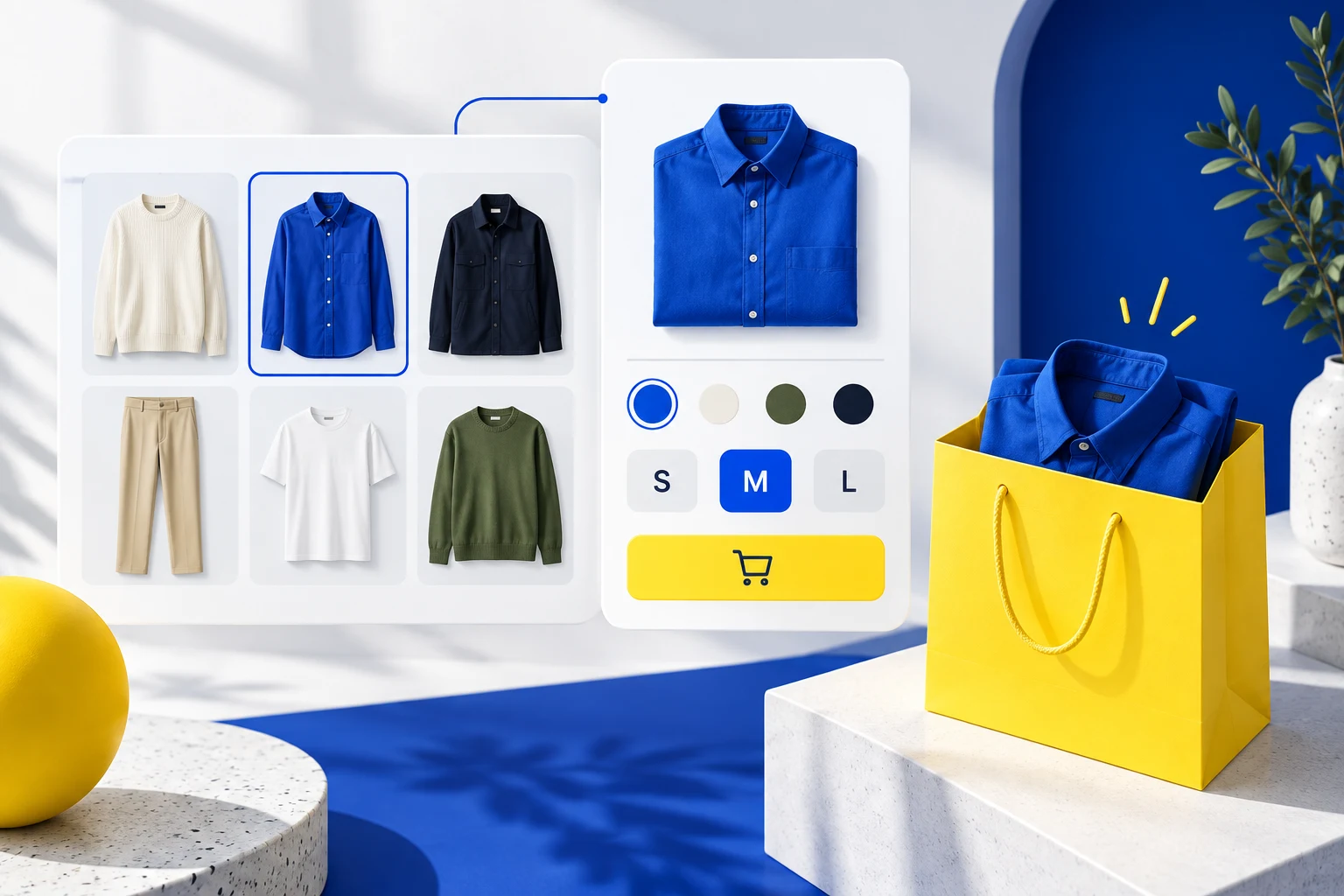
StoreBuilt inspected the quick-add assessment in our own storefront audit implementation and Shopify’s variant guidance for this article. Our audit already distinguishes simple products from option-heavy purchases. That distinction matters more than whether a collection card happens to contain an Add to cart button: the customer must be able to make the required choice before the store submits it.
Shopify quick add variants should preserve the size, colour and purchase mode the shopper intended. A faster click is not a better experience if it silently adds a default size. This guide sets out a design and acceptance process for UK ecommerce teams, using illustrative product scenarios rather than invented client conversion results.
Contact StoreBuilt to review the connection between collection cards, option selection and the resulting basket.
Table of contents
- Decide which products qualify for direct add
- Connect visual choices to the submitted variant
- Make the option panel a complete decision
- Treat cart feedback as part of the feature
- Test dynamic grids and competing controls
- Walk through a wrong-size scenario
- Include phone and keyboard acceptance
- Evaluate whether the shortcut helped
- StoreBuilt point of view
Decide which products qualify for direct add
Start by grouping products according to the decision needed before purchase. A single-format notebook may be suitable for direct add. A shirt needs a size decision. A personalised sign needs text or artwork. A replacement component may need a compatibility check that a small card cannot explain responsibly.
Do not turn a theme-wide switch into an assumption that every product shares the same buying journey. Define eligibility rules and identify the route for products outside them. “Choose options” or “View product” can be the more useful action when the customer needs information that is absent from the grid.
| Product situation | Appropriate starting action | Decision to preserve |
|---|---|---|
| One simple format | direct add | quantity and item identity |
| Clothing with sizes | option selection | explicit size and colour |
| Personalised product | full configuration | required customer inputs |
| Subscription option | purchase-mode selection | recurring versus one-time |
| Compatibility-led part | product detail or finder | correct fit |
The purpose is to remove redundant navigation, not necessary thinking. Write this rule into the merchandising brief so future products do not inherit an unsuitable shortcut accidentally.
Connect visual choices to the submitted variant
A swatch can change an image without changing the variant that the form submits. A size button can look selected while a hidden default remains active. These mismatches are why the acceptance review must inspect the resulting cart line rather than stopping at the card animation.
Shopify’s variant guidance describes variant selectors as components that can also appear in product grids and quick views. The implementation still needs to maintain the relationship between selected options and the actual product variant.
For each selection, compare the visible option values, image, price and availability with the item added. Do this in both directions: select blue then black, and black then blue. A control that works only when the shopper follows the original default order can hide a state-management problem during a casual review.
Make the option panel a complete decision
Keep a quick-view or option panel focused, but do not remove essential information merely to make it small. The shopper needs a recognisable product name, clear option labels, relevant pricing and a way to reach fuller details. A size guide link may be useful where sizing affects the decision.
Do not preselect an arbitrary size and make it look like an intentional customer choice. If a default is used for a legitimate product reason, make it obvious and test whether shoppers understand it. Unavailable combinations should be explained without forcing people through repeated failed clicks.
Use plain action labels. “Choose size” communicates why another step exists. “Quick buy” can create the expectation of an immediate purchase even when the next panel requires several decisions. For clothing-specific information design, pair this work with the Shopify size-guide advice.
Treat cart feedback as part of the feature
After submission, the interface should distinguish success from failure. A spinning button followed by a drawer opening is not enough if the requested item never entered the basket. Show the result clearly and allow the shopper to recover when stock or another condition prevents the add.
Avoid duplicate submissions from rapid taps. While a request is pending, the control should behave predictably and should not leave the shopper guessing whether another tap is needed. Once complete, verify that the quantity reflects the intended action rather than the number of impatient clicks.
Keep the collection context useful. If a cart drawer opens, closing it should let the customer continue from the product they were considering. The Shopify cart-drawer patterns guide covers the wider drawer experience; the quick-add test should specifically prove that the correct line arrived there.
Test dynamic grids and competing controls
Collection pages often change after filters, sorting or additional products are loaded. Test quick add on cards that were not present in the first screenful. A working initial grid does not prove that newly rendered controls have the correct product data or interaction handlers.
Use two similar products side by side. Choose a size on the first, then a different colour on the second. Confirm that one card’s state cannot influence the other. Repeated product-form identifiers or shared state can be difficult to notice when QA uses only one item.
Check search results and featured collection sections separately if they reuse the same card design. Similar appearance does not guarantee identical implementation. Record the surfaces included in the release so a homepage quick-add failure is not dismissed because the collection template passed.
Walk through a wrong-size scenario
Consider an illustrative clothing store where the card shows a blue shirt and the shopper selects medium. The drawer displays small after quick add. The correct first response is to record the selected options and the submitted item, not to remove the small variant from the catalogue.
Repeat the action from a clean page, then after changing the colour. Next, test the full product page. If the product page adds medium correctly while the card adds small, the investigation can focus on the collection interaction and its submission state.
Define the repair in customer terms: the selected blue medium shirt is what enters the basket, with accurate price and quantity. Then test the adjacent cases: unavailable medium, a different colour, another product and a failed request. This guards against a patch that fixes one default path while leaving the underlying mismatch elsewhere.
Include phone and keyboard acceptance
A control that appears only on hover is not a dependable mobile action. Keep the primary route visible and ensure option targets can be selected without accidentally opening the product page underneath them. Test with the actual sticky header, chat control and cart drawer present.
For an option dialog, check where focus goes when it opens and where it returns when it closes. A keyboard user should be able to reach the options, understand the selected state and finish or cancel the action. Shopify’s accessibility guidance supports reviewing keyboard controls and dynamically changing product information.
| Test case | Pass condition | Evidence to retain |
|---|---|---|
| Size and colour changed | exact variant enters cart | selection and cart comparison |
| Rapid repeated taps | predictable quantity | request and result recording |
| Stock changes | clear failure and recovery | error-state screenshot |
| Filtered collection | new cards work correctly | filtered journey recording |
| Two product cards | choices remain independent | alternating-selection check |
| Keyboard and mobile | options and feedback reachable | complete task review |
Use this matrix before broad rollout and keep it with the theme change. It is short enough for a release review while covering failures that a visual screenshot cannot establish.
Evaluate whether the shortcut helped
Compare useful basket additions and completed purchases alongside wrong-item enquiries, removals and returns where reliable data exists. An increase in quick-add clicks can simply reflect accidental interaction. It should not be presented as conversion improvement without the wider evidence.
For an initial release, choose a product group with straightforward options and a clear baseline. Keep more complex products on their established path until the option panel can represent their requirements. Expand based on successful customer tasks rather than pressure to make every collection card identical.
StoreBuilt point of view
Quick add should remove an unnecessary page visit while preserving the purchase decision. StoreBuilt would prioritise exact variant identity, understandable errors and accessible controls over a faster animation. The right product in the basket is the standard that matters.
For a scoped theme improvement, explore Shopify design and development or Contact StoreBuilt with the product and option combination that currently fails.
Related implementation guide
Preserve custom purchase behaviour during a Shopify theme update.