
What we have seen in checkout work is this: one-page checkout gets talked about as a speed feature, but the real result depends on whether the checkout becomes easier to complete, not simply shorter to describe.
Some stores gain from it quickly. Others expose more friction because too much information lands on one screen with too little hierarchy.
If your UK Shopify checkout needs evidence-led improvement rather than guesswork, Contact StoreBuilt.
Table of contents
- Keyword decision and research inputs
- What one-page checkout changes in practice
- When it tends to help UK ecommerce brands
- One-page checkout decision table
- What to test before and after rollout
- StoreBuilt example
- 30-day optimisation plan
- Final StoreBuilt point of view
Keyword decision and research inputs
Primary keyword: shopify one-page checkout
Secondary keywords:
- Shopify checkout UK
- one page checkout ecommerce
- Shopify mobile checkout
- checkout conversion Shopify
- Shopify checkout optimisation UK
Search intent: solution-aware research with CRO implementation intent.
Funnel stage: middle to bottom.
Page type: checkout optimisation guide.
Why StoreBuilt can realistically win this topic:
- We can frame one-page checkout as a conversion system, not a trend.
- Competitor content often praises checkout simplification without enough operational nuance.
- StoreBuilt can connect checkout layout decisions to wallets, delivery messaging, trust cues, and error recovery.
Research inputs used in angle selection:
- Current SERP review around
shopify one-page checkout, checkout conversion terms, and mobile checkout modifiers. - Charle’s guide-style publishing patterns and adjacent UK Shopify agency content around CRO topics.
- Shopify checkout product positioning and broader ecommerce UX best practice signals.
What one-page checkout changes in practice
One-page checkout changes how friction is presented.
Instead of moving the customer through multiple staged screens, more of the task appears in one continuous experience. That can reduce step anxiety and help experienced buyers move faster, especially on mobile with strong wallet support.
But the tradeoff is real. If too many fields, messages, or payment choices compete for attention, the single page can feel heavier than a well-structured multi-step flow.
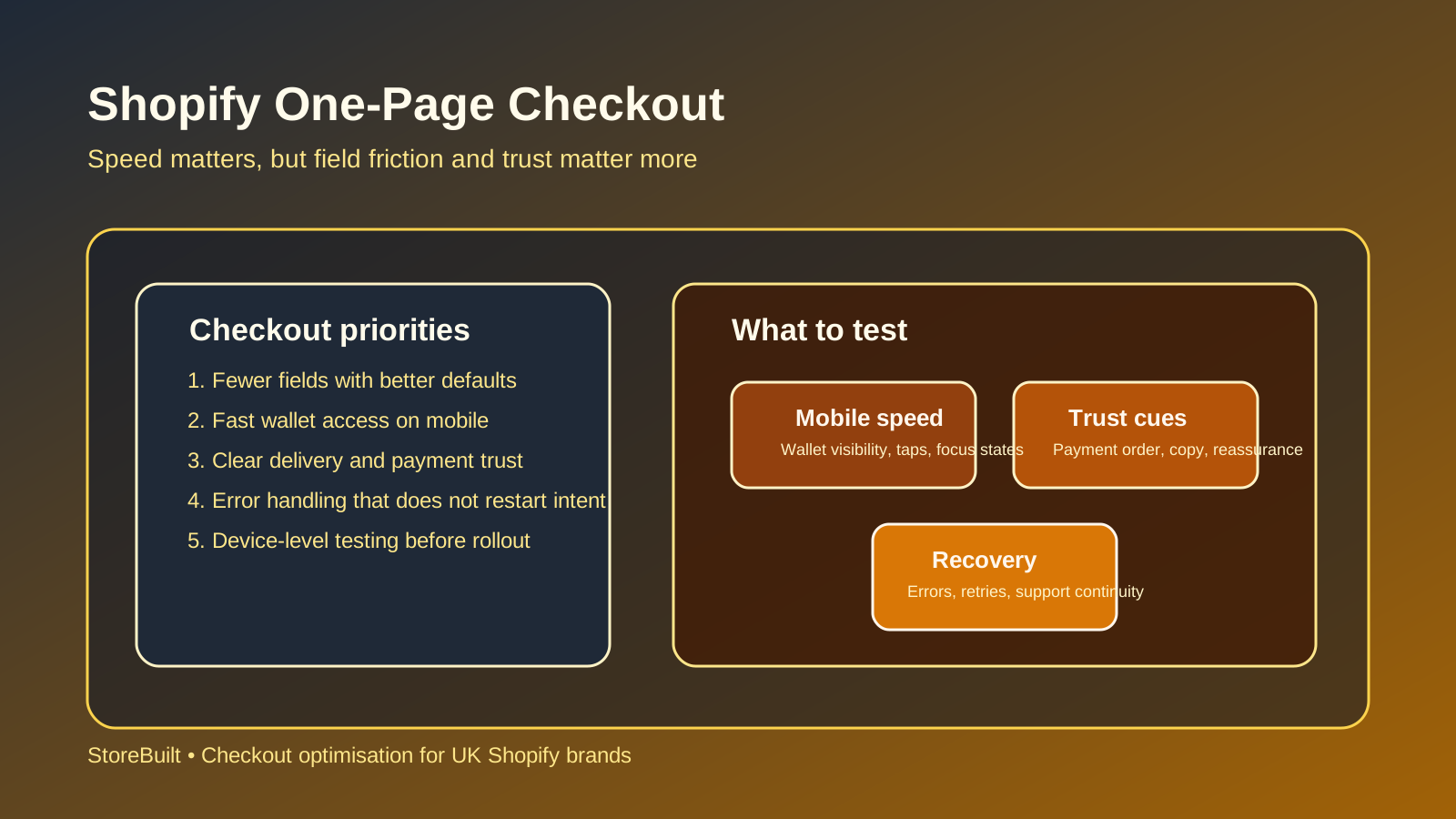
In practice, one-page checkout changes these areas most:
- field density
- visual hierarchy
- wallet visibility
- delivery and trust communication
- error recovery behaviour
That is why rollout should be treated as a CRO event, not just a platform update.
When it tends to help UK ecommerce brands
It often helps when checkout demand is high-intent and the business already has strong trust signals.
Typical fit conditions:
- mobile traffic is significant
- basket content is straightforward
- delivery rules are clear
- the payment mix is not cluttered
- support and QA teams can monitor the rollout closely
It is especially useful where the main friction is unnecessary steps rather than complex buying decisions.
| Checkout profile | One-page checkout fit | Main watch-out |
|---|---|---|
| simple DTC basket | strong | trust and delivery copy still need to be obvious |
| high-AOV consideration purchase | moderate | reassurance and objections may need more support |
| heavy discount or bundle logic | moderate | summary clarity matters more than speed alone |
| B2B or mixed DTC-trade | lower by default | exception paths can add friction back in |
| subscription-heavy flow | depends | payment logic and rebill clarity need extra QA |
For many UK brands, the biggest gain comes when one-page checkout is paired with cleaner delivery promise copy, more visible wallets, and stronger error handling.
One-page checkout decision table
Before treating one-page checkout as the answer, evaluate the broader checkout system.
| Area | Good signal for one-page checkout | Warning sign |
|---|---|---|
| Basket clarity | products and shipping choices are easy to understand | multiple edge-case rules create confusion |
| Payment setup | trusted methods are already strong | too many low-signal options clutter the view |
| Mobile experience | forms are manageable and wallets are visible | keyboard and focus behaviour are frustrating |
| Support load | post-checkout questions are already under control | customer confusion is high even before rollout |
| Testing capability | you can track performance by device and method | rollout would be mostly blind |
The one-page question should not be “Is it newer?” It should be “Does it reduce effort for our actual customer mix?”
If that answer is uncertain, run a smaller diagnostic first. StoreBuilt CRO and UX optimisation is designed for exactly this kind of decision.
What to test before and after rollout
This is where many teams underperform. They judge the idea instead of the implementation.
Pre-rollout, test:
- mobile wallet prominence
- form autofill behaviour
- address-entry friction
- delivery option comprehension
- payment error recovery
Post-rollout, track:
- completion rate by device
- form-abandonment behaviour
- payment success by method
- support tickets linked to checkout confusion
- average time to complete checkout
| Test area | Why it matters |
|---|---|
| Wallet-first visibility | can lift speed without adding cognitive load |
| Field ordering | reduces input friction on mobile |
| Delivery promise placement | protects trust close to purchase |
| Error messages | poor recovery destroys otherwise strong checkout flow |
| Discount interaction | promo complexity can interrupt momentum |
The best one-page checkouts feel lighter because they are better prioritised, not because they contain less important information.
StoreBuilt example
One Shopify brand expected a checkout-format change to solve conversion softness immediately. Their belief was that too many steps were causing mobile users to leave.
The review showed a more layered issue. Delivery messaging was vague, wallets were not visually dominant enough, and some failed-payment states returned users to a confusing point in the flow. A simpler page alone would not have fixed that.
Once the team improved hierarchy, cleaned up payment presentation, and clarified the delivery promise, the checkout became easier to complete and easier to support. That is the lesson: rollout success comes from the full checkout system, not the label.
30-day optimisation plan
Treat the rollout as a monitored commercial change.
| Timeline | Focus | Output |
|---|---|---|
| Days 1-5 | benchmark pre-rollout checkout behaviour | conversion baseline |
| Days 6-12 | validate mobile experience, wallets, and payment order | release-ready QA list |
| Days 13-21 | monitor live behaviour by device and payment type | early performance read |
| Days 22-30 | refine copy, hierarchy, and error paths | post-rollout optimisation plan |
Questions worth asking weekly:
- Did mobile completion improve meaningfully?
- Did support tickets change in volume or type?
- Are payment failures concentrated around a specific method?
- Is delivery confusion lower or simply moving later in the journey?
If you cannot answer those questions, the checkout is not yet being managed as a growth system.
For brands that want checkout work tied to the full storefront journey, StoreBuilt support, maintenance, and audits is often the right next step.
High-intent AI search implementation layer
The AI-search version of this topic is not just “write more content”. A useful answer engine result needs a page that gives a direct answer, proves the claim, and shows the next operational step inside Shopify.
| Area | StoreBuilt implementation check |
|---|---|
| Primary intent | The page should map to shopify one-page checkout and one clear buyer or operator problem, not a vague traffic topic. |
| Shopify surface | Identify whether the work belongs on a collection, product page, theme section, checkout step, app workflow, email flow, or support process. |
| Proof | Add first-hand observations, product/category examples, screenshots, policy notes, review signals, or trustworthy external sources where they make the advice safer. |
| Internal route | Link the reader to the service most likely to solve the issue: CRO and UX optimisation. |
| Measurement | Check Search Console, analytics, assisted conversions, enquiry quality, and AI-response mentions after the update rather than judging success by pageviews alone. |
For this article, the useful research inputs are: StoreBuilt CRO audit patterns, analytics QA checks, Shopify theme constraints, and buyer-intent SERP patterns. StoreBuilt would prioritise PDP hierarchy, cart friction, mobile merchandising, testing policy, analytics QA, and measured releases before expanding into broader supporting content.
If this topic maps to a live store problem, review the related StoreBuilt service or Contact StoreBuilt with the store URL and the issue you want fixed.
Final StoreBuilt point of view
One-page checkout is not automatically better because it is faster to describe or newer in product language. It is better only when the single page makes buying easier for your customer, on your devices, with your payment and delivery model.
The winning checkout is the one that reduces effort without reducing clarity. That is what UK ecommerce teams should optimise for.