
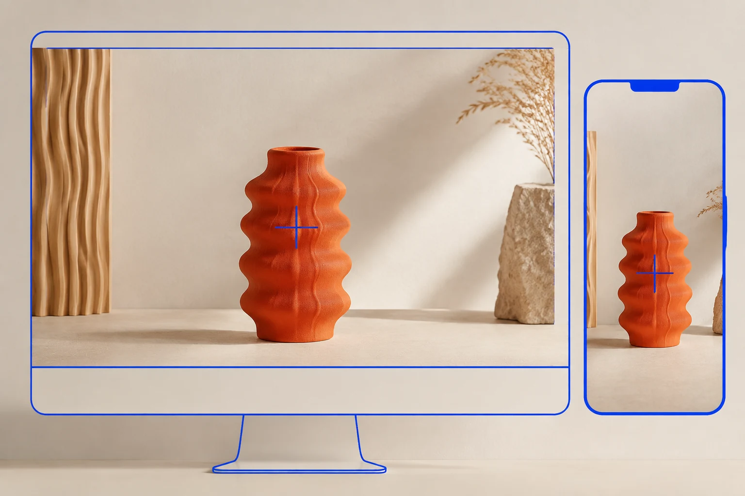
StoreBuilt checked Shopify’s focal-point documentation while preparing this guide and found a practical constraint that should shape the design brief: an image has one focal point, shared wherever that image is used. A crop that works in a wide homepage banner can therefore conflict with a narrow card or mobile section.
Shopify image focal points help preserve the important subject when an image is cropped. They do not make every composition work in every container. This guide focuses on responsive crop decisions and acceptance checks for UK ecommerce teams, with illustrative examples rather than claimed client conversion results.
Contact StoreBuilt to review how your campaign imagery behaves across desktop and mobile.
Table of contents
- Identify what must remain visible
- Understand focal-point behaviour
- Match the image to the component
- Plan mobile art direction
- Keep text and product truth intact
- Run a crop acceptance review
- StoreBuilt point of view
Identify what must remain visible
Start with the image’s job. A product card should let the shopper recognise the item. A lifestyle banner may need to show a product in use. A detail photograph might intentionally focus on one fitting or texture. The right crop depends on that purpose, not on a universal preference for centred subjects.
Write a simple acceptance statement before editing: “The complete handle and spout remain visible”, “The model’s footwear is shown”, or “The installation connection is identifiable”. This gives the designer and merchandiser a shared test. “Make the image look better on mobile” is too subjective to support repeatable review.
| Image role | Essential content | Common crop failure |
|---|---|---|
| Product card | recognisable complete item | handles or legs disappear |
| Lifestyle hero | product and useful context | product becomes a tiny background detail |
| Detail image | relevant material or fitting | crop loses the feature being discussed |
| Collection banner | category cue and text space | subject competes with the heading |
| Comparison visual | consistent view of alternatives | one item appears misleadingly larger |
Avoid judging only the source file. The customer sees the image after the theme has placed it into a container, selected a responsive size and applied any crop. The asset and its final rendered use must be reviewed together.
Understand focal-point behaviour
Shopify’s image guidance describes setting a focal point by selecting the important area of an image. It documents one point per image and notes that the same point applies when the image is reused in multiple places. Third-party theme support should be checked with the theme’s documentation.
A point identifies an area of priority; it does not describe the full outline of a product. Keeping the centre of a tall vase visible may still cut off its base when the container is very wide. Moving the point cannot create missing space around the original subject.
Inspect the actual section after saving. A theme can have different rendering behaviour for banners, product cards and custom blocks. If one component ignores the intended positioning, establish whether that is a supported setting or an implementation issue before repeatedly editing the source image.
Keep a note of shared usage before changing a widely reused asset. Improving the homepage crop may alter a collection banner that previously worked. When the uses require conflicting compositions, separate assets can be clearer than repeatedly moving the same shared point.
Match the image to the component
Choose the container’s shape deliberately. A square card, wide banner and portrait feature tell different visual stories. A photograph with the product near one edge may work beautifully with text beside it on desktop, yet lose the product when cropped to a narrow phone layout.
Decide whether the component should show the whole image or fill a fixed frame. Showing the whole image can leave surrounding space; filling a frame can crop content. Both can be reasonable design choices. The problem is choosing one accidentally and then expecting the focal point to remove the trade-off.
For product grids, consistent framing helps comparison. Products should remain recognisable and have sensible relative visual scale. Do not make a small accessory appear equivalent in size to a large piece of furniture merely to fill every card. Use the wider product media system guide for broader asset planning.
Consider an illustrative homeware campaign with a tall orange vase photographed beside flowers. The desktop banner preserves the vase and space for a heading. A square collection card cuts off the vase’s base. The solution may be a different card composition with more space around the product, rather than moving the focal point away from the flowers repeatedly.
Plan mobile art direction
Review a narrow layout early in the creative process. If the product, model and contextual scene all need to remain visible, a desktop panoramic image may not be a suitable starting point for a tall mobile hero. Capture or create an alternative composition while the creative brief is still open.
Use separate mobile imagery when the theme supports it and the composition warrants it. Confirm the breakpoint and which asset is actually delivered. A mobile image setting that is never selected by the component does not solve the customer’s experience, even if the editor preview looks promising.
Keep the creative meaning consistent between versions. Mobile should not show a different bundle, included accessory or product finish unless that difference is intentional and clearly explained. Art direction is allowed to change framing; it should not silently change the offer.
| Desktop composition | Mobile challenge | Practical response |
|---|---|---|
| Product at far edge | subject disappears | alternate crop with useful safe space |
| Several products in a row | items become too small | simplified composition with clear context |
| Text embedded in image | words shrink or crop | move message into page text |
| Wide room scene | product loses prominence | closer product-focused view |
Document the intended asset pairing. Future merchandisers should know which desktop and mobile images belong to the same campaign. Clear names and a small usage register reduce the risk of mixing old and new creative during a busy promotion.
Keep text and product truth intact
Prefer real page text for headings, offer details and calls to action where practical. It can respond to screen size and remain readable without being trapped in the image crop. Position it with enough contrast and spacing from the subject, then test longer wording as well as the shortest campaign headline.
Alternative text should describe meaningful image content for its purpose. It is not a place to compensate for an unreadable offer baked into a banner or to repeat a list of keywords. Where an image is decorative, handle that through the site’s appropriate accessibility conventions.
Do not use cropping or retouching to hide a product feature that matters to the purchase. If a photograph shows a set of three but the listing sells one item, the surrounding copy and image selection must make that clear. A technically attractive crop can still create a misleading product impression.
AI-generated editorial imagery can support a conceptual article like this one. Actual product evidence needs an accurate representation of the item being sold. Validate colours, proportions, accessories and condition rather than assuming visual polish makes an image commercially reliable.
Run a crop acceptance review
Build a short review set containing the homepage hero, a collection banner, a product card, a product detail image and any custom promotional block. Use a narrow phone, a wider phone or tablet, and desktop. Check portrait and landscape where the component’s height changes significantly.
For each component, record whether the essential subject is visible, text overlaps it, the crop changes unexpectedly and the image remains clear at its displayed size. Open the page outside the theme editor as well. Preview controls are useful, but the storefront is the final customer surface.
Check performance separately from composition. A good crop can still load an unnecessarily large image or arrive too late in the page. Review the actual delivered dimensions and loading behaviour with the development team. Do not claim that moving a focal point alone improves page speed.
Repeat the review after a theme update, section replacement or major campaign change. Keep a screenshot of the accepted composition for key components, so future review has a reference. Prioritise the places where cropping removes product information or prevents reading before refining minor aesthetic differences.
StoreBuilt point of view
A focal point is a useful control inside a wider image decision. The most dependable storefronts choose compositions for their actual containers and verify them where customers browse. When the source image cannot support the required crop, changing the creative is often the clearest solution.
Contact StoreBuilt for a Shopify design review focused on product clarity across screen sizes.