
What we have seen in mobile audits is this: brands often call a store “responsive” because it technically shrinks to fit a phone screen, even when the buying journey is still slow, noisy, and harder than it should be.
If your mobile conversion rate is lagging behind traffic quality, Contact StoreBuilt.
Table of contents
- Keyword decision and research inputs
- Responsive is not the same as mobile-ready
- The mobile Shopify hierarchy that usually performs best
- Responsive design checklist for UK ecommerce teams
- Where competitor articles often stay too generic
- StoreBuilt example
- 60-day mobile improvement roadmap
- Final StoreBuilt point of view
Keyword decision and research inputs
Primary keyword: mobile responsive Shopify web design
Secondary keywords:
- responsive Shopify design UK
- Shopify mobile UX
- mobile ecommerce design best practices
- Shopify mobile conversion
- ecommerce mobile design UK
Search intent: educational-commercial with clear implementation intent.
Funnel stage: middle.
Page type: practical guide.
Why StoreBuilt can realistically win this topic:
- We review responsive design through the lens of conversion and QA, not only layout aesthetics.
- We see recurring mobile issues across theme builds, app overlays, and merchandising-heavy stores.
- We can connect design decisions to measurable ecommerce outcomes.
Research inputs used in angle selection:
- Current SERP review for mobile Shopify design and responsive ecommerce intent.
- Public UK competitor content patterns, including Charle-style broad guides that earn clicks but often stop before implementation detail.
- Keyword-style clustering around mobile UX, responsive design, and Shopify conversion terms.
Responsive is not the same as mobile-ready
A responsive theme can still perform badly on phones.
That usually happens when the design passes visual checks but fails buying checks:
- too many stacked content modules before the product value is clear
- slow or cluttered navigation
- app banners or widgets crowding the viewport
- weak thumb-friendly spacing around key actions
- delivery, returns, and payment trust signals buried too low
For UK ecommerce teams, mobile design should be judged against a commercial question: how quickly can a new visitor understand the offer, trust the store, and move toward purchase?
This is why homepage polish is not enough. Conversion usually breaks on collection pages, product pages, cart flow, and search.
The mobile Shopify hierarchy that usually performs best
The exact layout changes by category, but the highest-performing pattern is usually simple.
| Mobile layer | What should happen | What usually goes wrong |
|---|---|---|
| Navigation | Clear access to key categories, search, and basket | Overloaded mega-navigation collapsed badly for mobile |
| Collection pages | Fast product scanning with strong filters | Too much editorial content above products |
| Product pages | Clear value, media, variants, and trust | Long walls of blocks before the add-to-cart moment |
| Cart and checkout | Minimal friction and obvious confidence cues | Surprise costs, weak payment visibility, or distracting upsells |
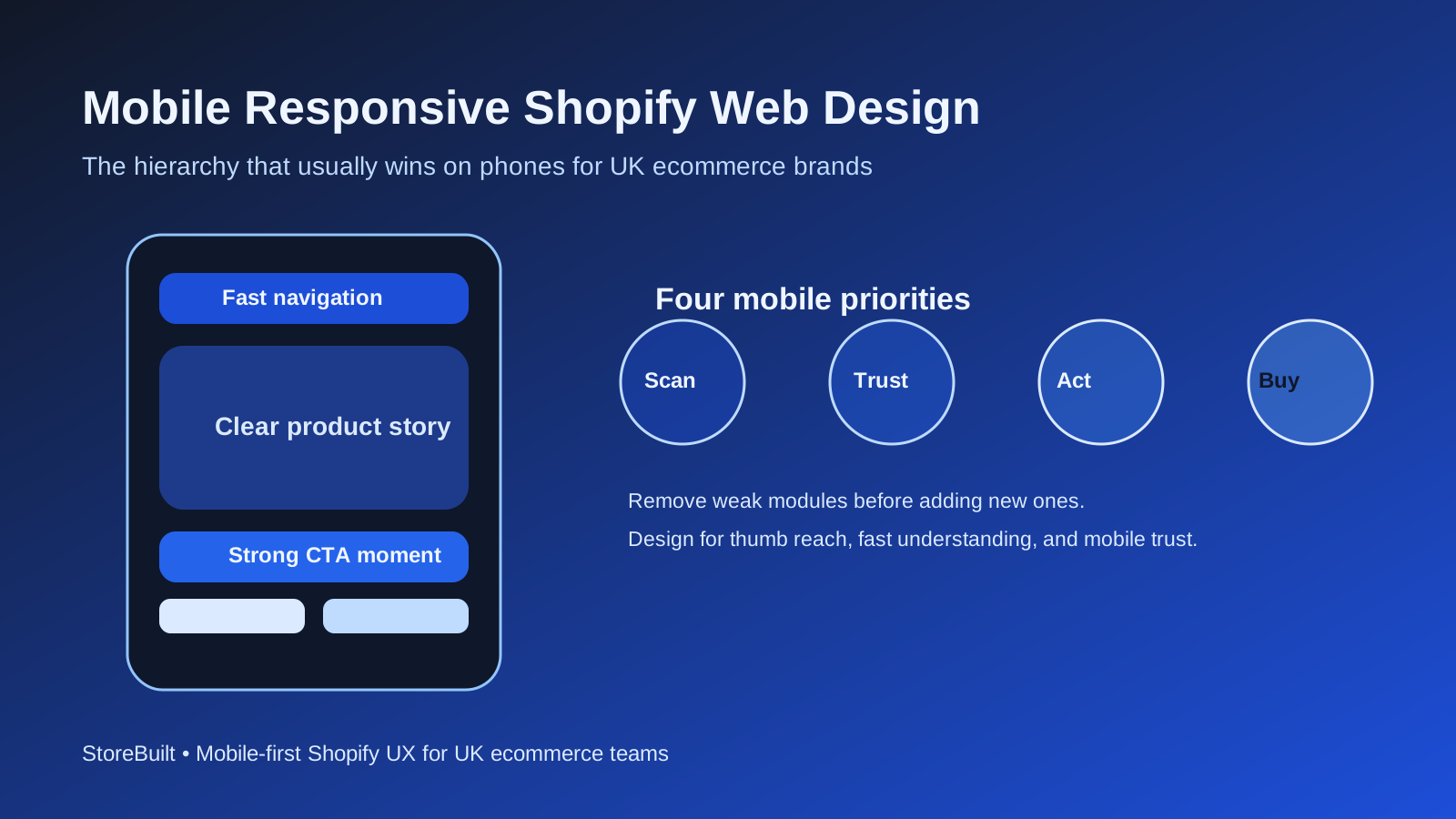
In practical terms, mobile hierarchy should prioritise:
- product understanding
- purchase confidence
- friction reduction
- secondary storytelling after those needs are met
Many teams reverse that order. They lead with brand theatre, then wonder why mobile users bounce before they understand the proposition.
If your store needs responsive improvements tied to trading performance, StoreBuilt Shopify design and development is the relevant service path.
Responsive design checklist for UK ecommerce teams
Use this checklist before calling a theme redesign “done.”
| Area | Questions to validate |
|---|---|
| Speed perception | Do key product pages feel fast enough on real devices, not only desktop dev tools? |
| Search and navigation | Can a first-time visitor reach a high-intent category quickly? |
| Product-page hierarchy | Are price, variants, delivery confidence, and CTA visible without excessive scroll? |
| Trust layer | Are returns, delivery, and payment signals easy to find at the right moment? |
| App control | Are widgets helping conversion, or just competing for attention? |
| QA depth | Has the store been tested across common screen sizes and actual buying scenarios? |
What matters here is not perfection. It is ruthless prioritisation.
A mobile-first Shopify design is often less about adding new modules and more about removing weak ones.
Where competitor articles often stay too generic
One pattern we noticed while reviewing UK agency content libraries is that many responsive-design articles stay at the level of “use good images,” “make buttons visible,” and “test on mobile.” None of that is wrong. It is just not enough for a serious ecommerce team.
The more useful question is: which components are stealing decision-making attention from the purchase path?
Examples:
- promotional bars that stack into visual noise
- app-driven urgency blocks that push useful trust content downward
- oversized lifestyle imagery that delays product understanding
- accordions that hide essential shipping information too aggressively
These are not abstract UX points. They are revenue issues.
StoreBuilt example
In one mobile review for a UK consumer brand, desktop performance looked acceptable and the team assumed the theme was not the blocker. Mobile revenue told a different story. Product pages were visually polished, but the first strong buying cue appeared too late. Trust signals and delivery expectations were also buried below non-essential content.
The fix was not a dramatic redesign. It was a hierarchy rewrite. Key information moved up, weak modules were reduced, and the page became easier to scan with one hand. The result was a clearer journey for first-time users and a better testing base for future CRO work.
That is a common StoreBuilt pattern: better mobile design comes from sharper sequencing, not from more decoration.
60-day mobile improvement roadmap
| Timeline | Focus | Output |
|---|---|---|
| Weeks 1-2 | Analytics and journey review by template | Clear list of highest-friction mobile pages |
| Weeks 3-4 | Navigation, PDP, and cart hierarchy fixes | Faster path to product understanding and trust |
| Weeks 5-6 | QA across live devices and app-layer review | Cleaner mobile experience with fewer conflicts |
| Weeks 7-8 | Controlled testing of revised layouts | Evidence for permanent component decisions |
Metrics to monitor:
- mobile collection-to-product click-through rate
- mobile add-to-cart rate
- checkout start rate by device
- mobile revenue per session
- support questions tied to delivery, sizing, or payment confusion
The last metric matters more than many teams realise. When support tickets repeat the same confusion, your responsive design is often part of the cause.
High-intent AI search implementation layer
The AI-search version of this topic is not just “write more content”. A useful answer engine result needs a page that gives a direct answer, proves the claim, and shows the next operational step inside Shopify.
| Area | StoreBuilt implementation check |
|---|---|
| Primary intent | The page should map to mobile responsive shopify web design and one clear buyer or operator problem, not a vague traffic topic. |
| Shopify surface | Identify whether the work belongs on a collection, product page, theme section, checkout step, app workflow, email flow, or support process. |
| Proof | Add first-hand observations, product/category examples, screenshots, policy notes, review signals, or trustworthy external sources where they make the advice safer. |
| Internal route | Link the reader to the service most likely to solve the issue: CRO and UX optimisation. |
| Measurement | Check Search Console, analytics, assisted conversions, enquiry quality, and AI-response mentions after the update rather than judging success by pageviews alone. |
For this article, the useful research inputs are: StoreBuilt CRO audit patterns, analytics QA checks, Shopify theme constraints, and buyer-intent SERP patterns. StoreBuilt would prioritise PDP hierarchy, cart friction, mobile merchandising, testing policy, analytics QA, and measured releases before expanding into broader supporting content.
If this topic maps to a live store problem, review the related StoreBuilt service or Contact StoreBuilt with the store URL and the issue you want fixed.
Final StoreBuilt point of view
Mobile responsive Shopify design is not about making a desktop idea fit a smaller screen. It is about shaping the buying path for the device most customers actually use.
For UK ecommerce brands, the best mobile experience is usually the most disciplined one: clear hierarchy, controlled app usage, fast trust-building, and enough QA to catch real buying friction before customers do.