
What we have seen in StoreBuilt audits is this: plenty of UK ecommerce sites look modern enough on first glance, but the real buying path is still full of hesitation points, weak hierarchy, and unclear commercial priorities.
If your current storefront looks polished but converts like a brochure site, Contact StoreBuilt.
Table of contents
- Keyword decision and research inputs
- What ecommerce website design means in the UK market now
- The five design layers that actually change outcomes
- A practical scorecard for design reviews
- Where UK Shopify stores usually underperform
- StoreBuilt example
- What to fix first in the next 30 days
- Final StoreBuilt point of view
Keyword decision and research inputs
Primary keyword: ecommerce website design uk
Secondary keywords:
- shopify website design uk
- ecommerce web design uk
- shopify design best practices
- ecommerce user experience uk
Search intent: commercial and evaluative. The reader usually wants a better ecommerce design outcome, a redesign direction, or a partner capable of improving storefront performance.
Funnel stage: middle to bottom.
Page type: practical guide with design review framework.
Why StoreBuilt can win this topic:
- We see where design work fails once real catalogue depth, merchandising pressure, and campaign traffic hit the store.
- We work inside Shopify constraints, not just Figma concepts.
- We can connect design decisions to CRO, development scope, and merchant usability.
Research inputs used:
- Current SERP scan around
ecommerce website design uk,shopify website design, and related redesign-intent modifiers. - Competitor pattern review across Charle articles and We Make Websites blog.
- Internal duplicate-risk pass against current StoreBuilt design, CRO, and agency-selection articles.
What ecommerce website design means in the UK market now
In 2026, “good ecommerce design” in the UK is not a style debate. It is a trading-system question.
The strongest Shopify stores do five things at once:
- make range discovery feel simple even when the catalogue is not small
- create fast trust for first-time visitors coming from search, paid, social, or brand campaigns
- reduce product-evaluation friction on mobile
- help the merchandising team trade the site without breaking consistency
- carry the shopper into checkout without introducing a second wave of uncertainty
This is one reason broad competitor content often under-explains the real problem. Many agency articles focus on inspiration, aesthetics, or platform features. Buyer teams usually need something more practical: how to tell whether a design system will survive live trading.
For UK brands, the commercial context also matters. Delivery promise clarity, returns confidence, local payment expectations, and category-specific proof signals all shape design effectiveness. A visually strong store that hides delivery thresholds, fit guidance, or customer reassurance too late in the journey is still badly designed.
If you need design work tied to live-store performance rather than surface polish, StoreBuilt can help.
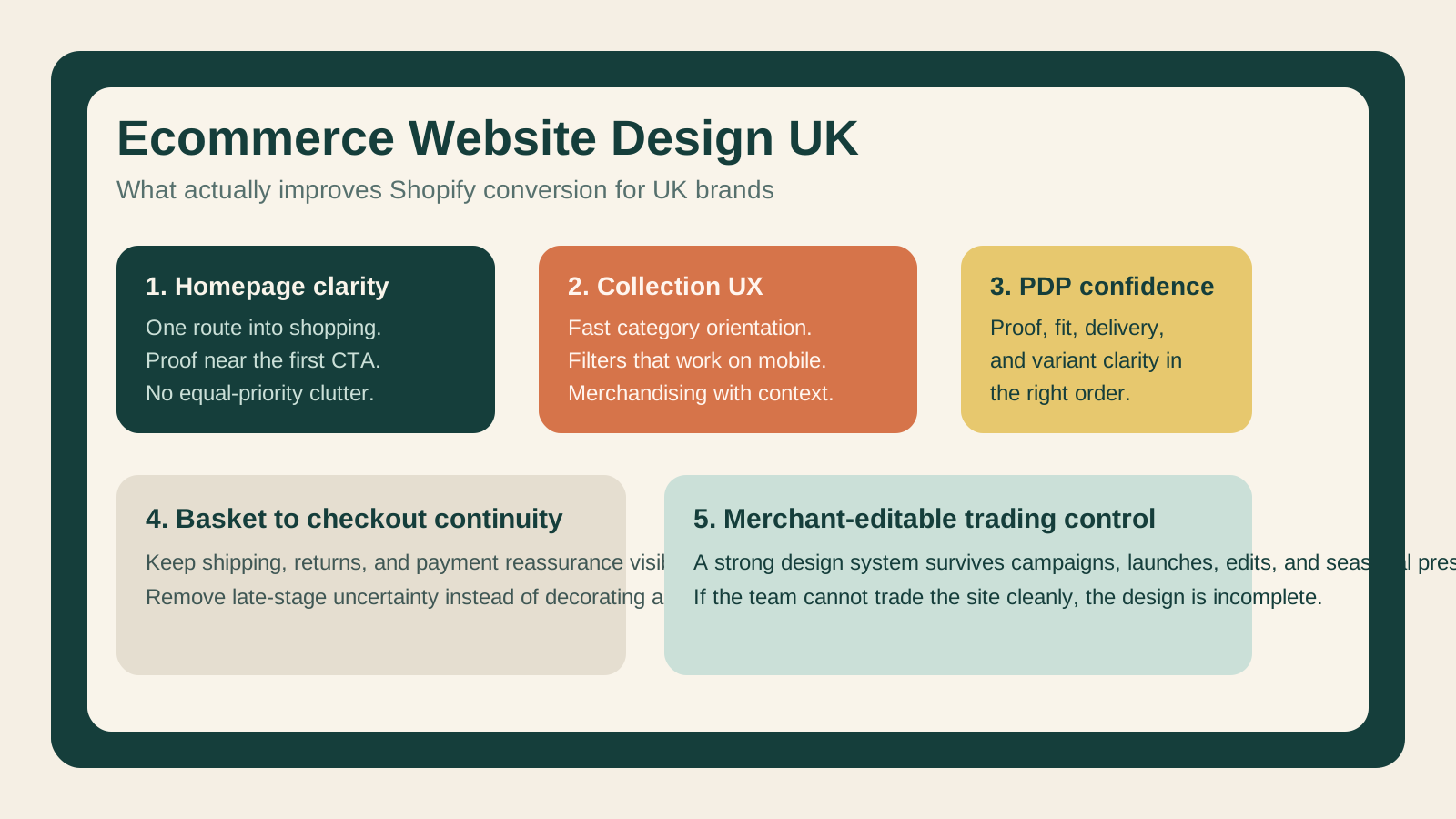
The five design layers that actually change outcomes
1. Homepage clarity
The homepage should establish who the store is for, what kind of products it sells, and where a high-intent visitor should go next.
Weak homepage design usually means:
- banner-led messaging with no obvious route into category discovery
- too many equal-priority blocks
- editorial copy that delays product understanding
- missing proof near the first major call to action
2. Collection and navigation design
For Shopify brands, collection design is often where money is won or lost. Navigation must support both first-time orientation and repeat shopper speed.
The practical questions are:
- can visitors narrow the range quickly?
- are category names buyer-friendly rather than internally convenient?
- does the filter logic support real shopping behaviour on mobile?
- do collection pages help evaluation, not just display products?
3. Product-page decision support
A product page should answer the final pre-purchase doubts in the right order. The hierarchy usually matters more than adding more components.
The strongest PDPs prioritise:
- confidence in the product fit
- confidence in delivery and returns
- confidence in quality and proof
- confidence that the shopper is choosing the right variant or bundle
4. Basket-to-checkout continuity
Many redesigns improve discovery but leave the basket experience commercially weak. If discount logic, shipping thresholds, or payment reassurance appear too late, basket hesitation rises.
5. Merchant-editable trading control
This is the layer most design-first articles ignore. A store is not really well designed if the in-house team cannot safely update landing pages, trading modules, campaign slots, merchandising order, and core copy without engineering friction.
That matters because good ecommerce design must survive Black Friday, new arrivals, seasonal campaigns, stock issues, and repeated iteration.
A practical scorecard for design reviews
| Review area | What good looks like | Common failure mode |
|---|---|---|
| Hero section | One clear commercial route into the catalogue | Style-led messaging with weak next steps |
| Navigation | Fast route to high-intent categories | Overcrowded menus and vague labels |
| Collection pages | Filters, proof, and product scanning work together | Endless grids with little buying guidance |
| PDP hierarchy | Objections answered in buying order | Product details present but badly sequenced |
| Mobile UX | Thumb-friendly, fast, and scannable | Desktop logic compressed into mobile |
| Basket flow | Low-friction transition into checkout | Last-minute uncertainty around shipping, trust, or totals |
| Content governance | Team can trade the store safely | Design depends on developer intervention for routine updates |
A fast rule from StoreBuilt: if a redesign deck cannot explain how it improves category discovery, PDP confidence, and merchandising control, it is not ready yet.
Where UK Shopify stores usually underperform
Across audits, the recurring weaknesses are surprisingly consistent.
Design is treated as a launch asset, not an operating system
The store looks strong at go-live, then starts degrading because campaign modules, promotional blocks, app widgets, and quick fixes accumulate without structure.
Merchandising and UX are split apart
The design team creates a clean storefront, but the trading team needs to push hero products, bundles, seasonal edits, and promotional logic. If those realities are not built into the system, the store becomes messy within weeks.
Proof is under-used in high-consideration moments
Many brands have product credibility, customer reviews, press mentions, or ingredient and sourcing evidence, but the design does not surface it where hesitation actually happens.
Mobile hierarchy is still treated as a responsive adaptation
The best UK ecommerce stores design for mobile purchase behaviour directly. The weaker ones simply stack desktop sections vertically and call it done.
StoreBuilt example
In one StoreBuilt review for a UK lifestyle brand on Shopify, the storefront looked premium but behaved like a catalogue with little commercial guidance. The homepage pushed too many routes at once, collection pages did not help filtering enough, and the PDP relied on dense copy to answer simple objections.
The fix was not a dramatic visual reinvention. We reworked hierarchy, introduced clearer proof placement, simplified choice architecture, and made merchandising modules easier for the internal team to control. The result was a storefront that felt less decorative and more decisive.
That is a common pattern. The design improvement that matters most is often structural clarity, not visual novelty.
What to fix first in the next 30 days
If the current store is underperforming, start here:
- Review the homepage and identify whether the first screen gives one strong route into shopping.
- Check the top five collection pages on mobile and remove any scanning friction or filter confusion.
- Audit your highest-traffic PDPs for proof placement, variant clarity, delivery messaging, and add-to-cart confidence.
- Review basket and checkout pre-commitment messaging so shipping, returns, and payment reassurance are not delayed.
- Test whether the merchandising team can update the storefront quickly without creating design debt.
If you want that turned into a practical redesign scope, Contact StoreBuilt.
High-intent AI search implementation layer
The AI-search version of this topic is not just “write more content”. A useful answer engine result needs a page that gives a direct answer, proves the claim, and shows the next operational step inside Shopify.
| Area | StoreBuilt implementation check |
|---|---|
| Primary intent | The page should map to ecommerce website design uk and one clear buyer or operator problem, not a vague traffic topic. |
| Shopify surface | Identify whether the work belongs on a collection, product page, theme section, checkout step, app workflow, email flow, or support process. |
| Proof | Add first-hand observations, product/category examples, screenshots, policy notes, review signals, or trustworthy external sources where they make the advice safer. |
| Internal route | Link the reader to the service most likely to solve the issue: CRO and UX optimisation. |
| Measurement | Check Search Console, analytics, assisted conversions, enquiry quality, and AI-response mentions after the update rather than judging success by pageviews alone. |
For this article, the useful research inputs are: Shopify Help documentation, StoreBuilt implementation patterns, UK ecommerce SERP intent, and common founder/operator questions. StoreBuilt would prioritise PDP hierarchy, cart friction, mobile merchandising, testing policy, analytics QA, and measured releases before expanding into broader supporting content.
If this topic maps to a live store problem, review the related StoreBuilt service or Contact StoreBuilt with the store URL and the issue you want fixed.
Final StoreBuilt point of view
The best ecommerce website design work in the UK is not the work that gets the most compliments in a design review. It is the work that makes buying easier, keeps trading cleaner, and gives the internal team more control without degrading the experience. On Shopify, design quality should be judged by commercial clarity first and aesthetics second, not the other way around.