
StoreBuilt compared Google’s mobile-content guidance with the W3C accordion pattern while preparing this guide. The useful distinction is between making a page shorter on screen and making its information harder to access. An accordion can do the first without doing the second, but only if its content and controls are designed together.
Shopify product accordions work best when they organise genuine buying questions. For a UK ecommerce catalogue, dimensions, materials, care and delivery can deserve different treatment across product types. This is an implementation guide with illustrative examples, rather than a claim that one layout improves every store.
Contact StoreBuilt to review the information hierarchy on your product templates.
Table of contents
- Decide what must be visible before a click
- Name panels after customer questions
- Preserve mobile content and usable controls
- Work through a lamp product example
- Build an acceptance matrix around real tasks
- Measure discovery rather than clicks alone
- StoreBuilt point of view
Decide what must be visible before a click
Start by listing the facts a shopper needs to choose the item confidently. A concise product purpose, important fit limitation or assembly requirement can affect the purchase immediately. Hiding all of that behind a generic “More information” control makes the page tidy at the customer’s expense.
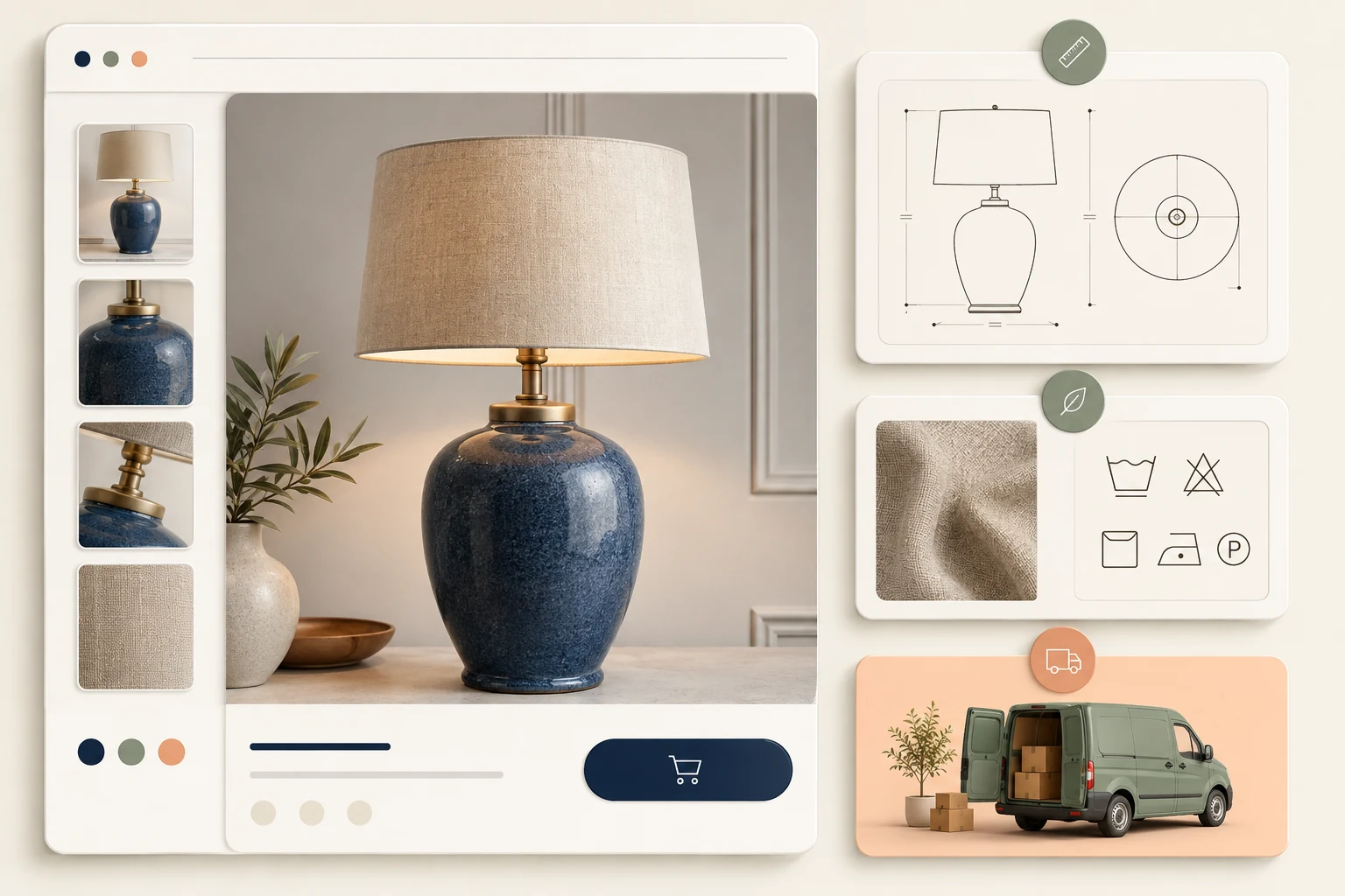
Separate a short decision summary from supporting detail. A lamp might show its overall dimensions near the buying controls, then provide a fuller measurement diagram inside a dimensions panel. The summary and detailed version should agree and draw from a maintainable content source.
Do not turn every paragraph into a panel. A short description can be easier to read as ordinary text. Introduce disclosure only when it helps the shopper scan and choose which detail to explore. Extra clicks are a cost, even when the animation looks polished.
Review the existing product content model before changing presentation. If dimensions and materials are embedded inconsistently in large descriptions, the first task may be making those values reliable, not replacing the visible component.
Name panels after customer questions
Labels should predict what opens. “Dimensions and fit” is more useful than “Details” when the customer is checking whether a product fits a shelf. Keep labels short enough for mobile without replacing meaningful language with unfamiliar abbreviations.
| Product situation | Useful panel | Information to keep visible |
|---|---|---|
| Furniture | Dimensions and access | overall footprint |
| Clothing | Fit and measurements | fit summary |
| Ceramics | Materials and care | intended use |
| Lighting | Installation and fittings | installation requirement |
| Personalised gift | Artwork and production | approval affects timing |
| Multi-part kit | What is included | essential exclusions |
Avoid mixing unrelated answers in a single panel just because the template has a limited number of slots. Delivery timing and fabric care have different purposes. If the theme cannot express the catalogue clearly, improve the content structure before filling it with compromises.
Omit an empty panel entirely or provide a deliberate fallback that is useful and accurate. A visible heading that opens onto blank space suggests missing information. A duplicated generic paragraph is little better, especially when it appears on products with materially different requirements.
Preserve mobile content and usable controls
Google’s mobile-first guidance permits different presentation, including tabs or accordions, while retaining equivalent content. Do not remove substantive details from mobile just to achieve a shorter screenshot.
Make the content available without requiring a shopper interaction to fetch essential text. Check rendered mobile HTML and the actual page experience. A desktop content audit cannot establish what the mobile version supplies, particularly when an app injects panels or a theme uses separate templates.
For a custom accordion, follow the W3C accordion pattern: meaningful heading structure, operable controls and an expanded state that reflects the visible panel. Test keyboard navigation, opening and closing, and links inside the revealed content. A plus icon alone does not communicate the whole control.
Keep focus visible and avoid moving it unexpectedly when a panel opens. Test long panels with zoom and larger text. The customer should be able to reach a size chart or manual link without the sticky buying controls covering it. Our Shopify development team can review the theme-level behaviour alongside content.
Work through a lamp product example
Imagine a homewares merchant selling a table lamp in two sizes. The page has a short introduction, a size selector and three panels: dimensions, materials and care, and delivery. This is an illustrative design review, not a reported StoreBuilt project outcome.
The small lamp is selected initially. Opening dimensions reveals the corresponding measurements and a diagram. When the customer selects the large lamp, the open panel needs to remain understandable and show the correct information. A static diagram for the small version would undermine an otherwise clear variant selector.
Now consider the delivery panel. A generic promise copied across all products may conflict with a made-to-order variant. Decide whether the panel shows product-specific information, links to a delivery policy, or combines a concise exception with the broader policy. The choice should follow fulfilment truth.
Finally, view the page on a narrow phone. The panel labels must remain readable, the diagram must fit, and opening one section should not hide the selected size behind an overlapping element. Ask someone unfamiliar with the catalogue to identify the lamp’s footprint and installation needs without prompting.
Build an acceptance matrix around real tasks
Test representative products before rolling the component across the entire catalogue. Include a product with every field, one with sparse information, one with long technical content and one with variant-dependent details. Each exposes a different weakness in a shared template.
| Task | What to observe | Acceptance result |
|---|---|---|
| Find overall dimensions | label and summary clarity | correct answer without help |
| Open panels by keyboard | focus and activation | controls remain usable |
| Switch a variant | dependent content update | no contradictory values |
| Read at enlarged text | wrapping and overlap | no lost information |
| Open a linked manual | link visibility and target | relevant document accessible |
| View sparse product | empty sections | no misleading blank panels |
Use a mix of observation and technical inspection. A successful click tells you the panel opens; it does not prove that the answer is correct. A valid markup check tells you about structure; it does not prove that customers understand the label.
Check the component after cart interactions and theme editor updates. Some theme features re-render sections, so event handling and unique identifiers need to survive the actual page lifecycle. Keep the verification focused on visible behaviour rather than assuming that the first load represents every state.
Measure discovery rather than clicks alone
A high panel-open rate can indicate interest, but it can also indicate that crucial facts are hidden. Pair interaction data with the task the shopper was trying to complete. Review support questions about dimensions, contents and delivery alongside the page changes.
Define a clear hypothesis before comparing layouts. For example, a visible dimensions summary plus a detailed panel may help shoppers check fit more quickly. Record which templates changed and what else changed during the same period, including campaigns and stock availability.
If traffic supports a controlled experiment, choose a meaningful outcome and guardrails in advance. Where traffic is limited, moderated task checks and a careful review of customer questions can still provide useful evidence. Do not convert a handful of observations into a claimed conversion uplift.
Give the merchandising team a short editing guide with examples of good labels and content boundaries. A technically sound component will drift if every editor interprets “Details” differently. The design should make accurate maintenance easier, not depend on one developer remembering the original intent.
StoreBuilt point of view
The right question is whether the page answers the customer’s next buying question with little effort. An accordion is one tool for doing that; its presence is not itself evidence of good UX or stronger SEO.
We would prioritise truthful content, meaningful labels and reliable mobile behaviour before animation. Once those foundations work, presentation can make the experience feel polished. Without them, a beautifully moving panel simply reveals confusion more elegantly.
Contact StoreBuilt for a product-information and theme implementation review.