
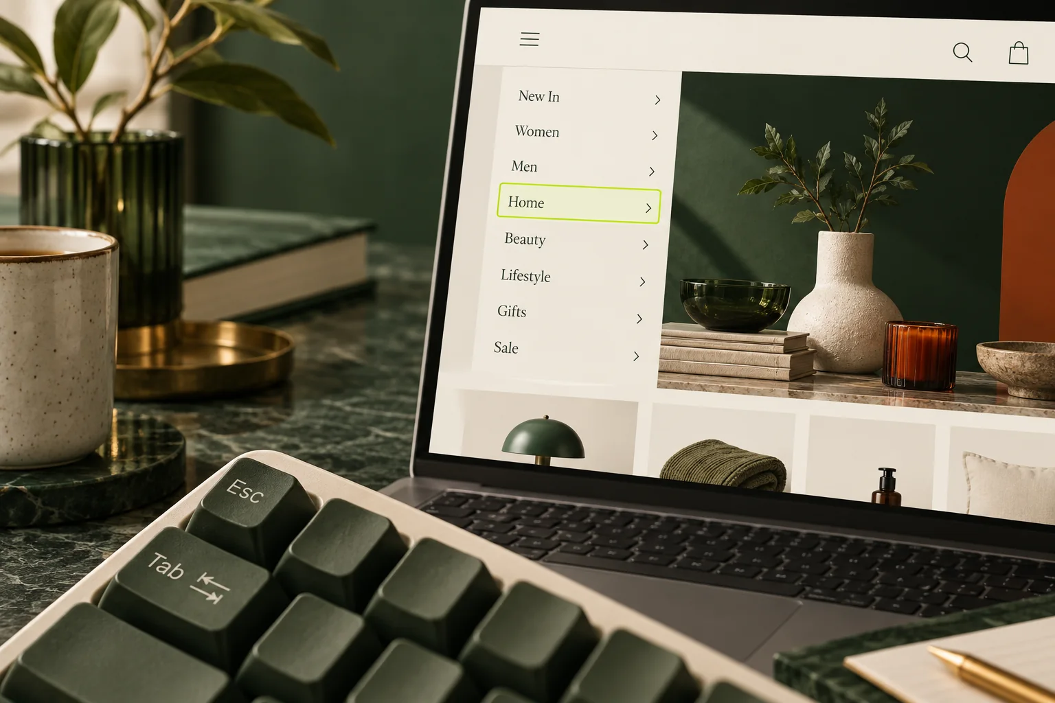
StoreBuilt’s review of Shopify theme accessibility guidance starts with a direct test: put the mouse aside and try to reach a collection through the main menu. Our implementation checks follow the customer’s actions, because a menu can look correct in a screenshot while its focus order or open state prevents someone from using it. The interaction is part of the storefront, not a finishing detail.
Shopify keyboard menu navigation matters on desktop and on smaller devices used with external keyboards or assistive technology. This guide gives UK ecommerce teams a focused way to test dropdowns and mobile drawers, describe defects and commission repairs. It is a component-level guide, not a full accessibility audit or a claim that passing these checks establishes legal compliance.
In this guide
- Map the menu before testing it
- Run a keyboard-only customer journey
- Distinguish links from disclosure controls
- Check visible focus and hidden content
- Treat mobile drawers as a separate interaction
- An illustrative homeware menu repair
- Write a useful repair brief
- Verify the change across real states
- StoreBuilt point of view
Map the menu before testing it
Identify the published theme, the header configuration and any app or custom code responsible for navigation. Record which templates use that header. A landing page may use a different layout, and a sticky header may create a second navigation instance after scrolling. Both can affect the customer’s journey.
List the intended actions. A top-level item might navigate directly to a collection, open a list of child links or provide separate controls for those two actions. Write down what the design intends before labelling the implementation broken. Ambiguous design produces ambiguous tests, especially when a label appears clickable but its first activation only opens a panel.
Shopify’s dropdown menu guidance explains the relationship between nested menu entries and theme presentation. Changing the menu data does not necessarily change the interaction logic. If the links are correct but the control cannot be operated, the repair is likely in the theme or navigation component.
Run a keyboard-only customer journey
Start at the top of a fresh page and use Tab to move forwards and Shift+Tab to move backwards. Keep track of where focus appears. Reach the navigation, open a relevant group, move to a child link and activate it. Then repeat the journey without relying on the pointer to rescue the interaction.
Use the keys appropriate to the control. A standard link activates with Enter; a native button normally supports Enter and Space. Check Escape when a dropdown is open and note what happens to focus afterwards. Do not assume that every website navigation must behave like an application menubar with arrow-key navigation.
Record the exact point of failure. “After opening Home with Enter, the next Tab moves to an invisible link” is actionable. “The menu is inaccessible” describes severity but gives a developer little reproduction detail. Include browser, operating system, viewport and whether the sticky header was active.
| Action | What to observe | Possible defect |
|---|---|---|
| Tab into the header | Logical order and visible focus | Focus is lost behind styling |
| Activate a disclosure | Panel opens and state is communicated | Hover-only behaviour |
| Tab through child links | Visible links can be reached | Hidden or skipped destinations |
| Press Escape | Open panel closes appropriately | Focus disappears or panel stays open |
| Shift+Tab backwards | Order remains understandable | Unexpected jumps between copies |
| Continue to page content | Navigation can be left | Keyboard trap |
Distinguish links from disclosure controls
A link takes the customer somewhere; a disclosure control shows or hides content. Keep those purposes clear in the design and markup. If a parent collection must remain directly accessible, consider a clear “View all” link inside the opened group or a deliberately designed separate link and toggle. Test the chosen pattern with real users where possible.
The W3C disclosure navigation example uses ordinary navigation links and disclosure buttons rather than the ARIA menu role. Shopify’s theme accessibility guidance likewise cautions against using menu and menuitem roles for ordinary navigation. Adding a role without its expected behaviour can make the component harder to understand.
Use native elements where they fit, and keep the control’s accessible state aligned with the visible panel. If the panel is open, the announced expanded state should reflect that. A CSS-only appearance change can leave assistive technology receiving a different description of the same interaction. The developer should verify both the visual state and the accessibility tree.
Check visible focus and hidden content
Focus styling must remain visible against the actual header background, including transparent or image-backed header states. Test normal and scrolled views. A subtle outline that looks acceptable on white may disappear over a dark campaign image. Avoid removing the browser’s focus indicator without a dependable replacement.
When a dropdown is closed, its hidden links should not create invisible stops in the Tab sequence. When it opens, customers should be able to reach the intended content in a predictable order. Watch for duplicate desktop and mobile menus that both remain focusable at the same viewport width.
Also check overlays. A cookie banner, search panel or cart drawer may sit above the header and change which controls are available. The customer should not be tabbing through links they cannot see or use. These interactions often share focus-management code, so a navigation repair deserves a short regression check of nearby components.
Treat mobile drawers as a separate interaction
A mobile drawer is not simply the desktop menu at a smaller size. It may cover the page, contain nested views and include account, search and localisation controls. Test it at a narrow viewport with a keyboard as well as by touch. Verify the open button, close button and any back controls inside nested groups.
If the drawer is implemented as a modal dialog, focus should be managed within that modal while it is open and returned appropriately when it closes. A non-modal disclosure has different requirements. Decide which pattern the component actually uses; do not add a focus trap to every expanded navigation panel indiscriminately.
Rotate or resize the viewport while the drawer is open. Check that the page does not become stuck with scrolling disabled, a hidden overlay or focus on a removed control. Then open the drawer again. The transition between responsive states can reveal bugs that a single static mobile screenshot will never show.
An illustrative homeware menu repair
Imagine a UK homeware store whose desktop “Rooms” panel opens on hover. Mouse users can select Kitchen or Bedroom, but pressing Tab moves directly from the parent item to the next top-level link. The child destinations exist in the page, yet the keyboard journey never reveals them.
The team replaces the hover-only dependency with a deliberate disclosure control, verifies the expanded state and checks the child-link sequence. It also tests the mobile drawer because both versions share part of the header code. This is an illustrative repair scenario, not a claimed client outcome or measured conversion improvement.
The acceptance test is a customer action: reach a room collection without a mouse, close an opened group and continue through the page. “Added ARIA attributes” is not a sufficient completion criterion. Attributes matter when they describe a working interaction accurately.
Write a useful repair brief
Give the developer the exact reproduction steps, expected behaviour and affected states. Include a short recording or annotated screenshots if available, but do not rely on screenshots alone to communicate a focus-order problem. Identify whether the issue occurs in the published theme, a preview or both.
Ask for the smallest reliable repair that respects the existing component architecture. A full replacement menu can create new maintenance and styling work when the defect is a missing event handler or incorrectly hidden element. Equally, a superficial CSS patch will not solve an interaction model that is fundamentally unclear.
Our Shopify design and development service can address the theme implementation. For the wider programme, use the accessibility remediation guide to coordinate navigation with forms, product selection and checkout-adjacent components.
Verify the change across real states
Repeat the original failing journey and one adjacent working journey. Test the header before and after scrolling, the desktop dropdown and the mobile drawer, and a page with a different hero background. Include a screen-reader check with an appropriate browser pairing when verifying names, roles and states; keyboard testing alone does not cover those announcements.
| Test state | Passing result | Record |
|---|---|---|
| Desktop dropdown | Open, navigate and close without pointer | Key sequence and destination |
| Sticky header | Focus remains visible and ordered | Scrolled-state check |
| Mobile drawer | Open and close with appropriate focus handling | Return-focus observation |
| Nested mobile group | Back and child controls remain usable | Full collection journey |
| Another overlay open | No invisible background interaction | Combined-state check |
| Responsive breakpoint | No stranded focus or scroll lock | Resize and reopen result |
Automated checks can identify some markup problems, but they do not prove that this whole interaction works. Retain a short manual acceptance script with the theme release notes. Repeat it after header changes, navigation app updates or significant theme upgrades.
StoreBuilt point of view
A menu succeeds when customers can choose where to go using their preferred input method. The best repair brief describes that journey precisely and verifies it after the code changes. Visual polish and accessible interaction belong in the same definition of a finished Shopify header.