
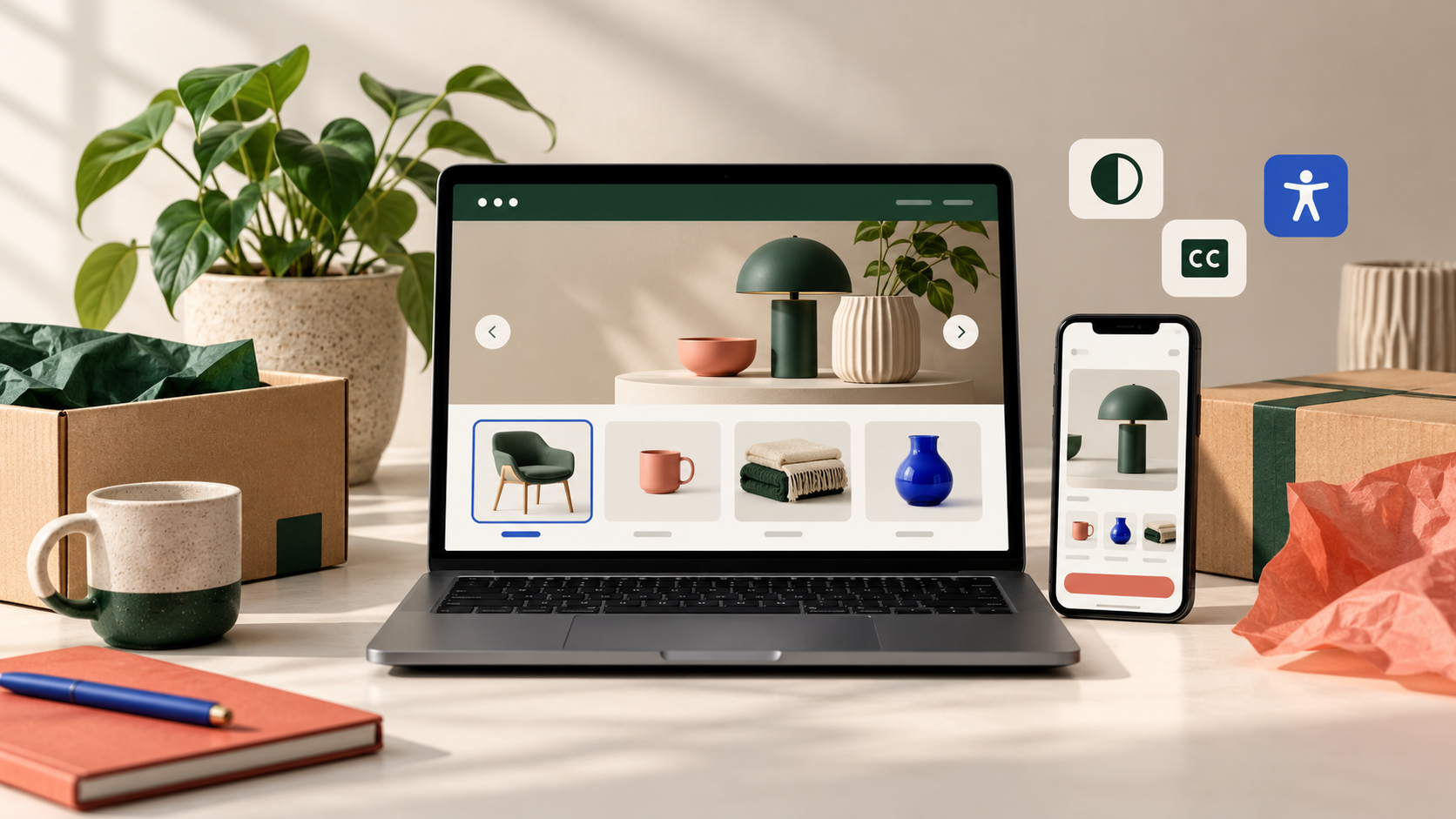
What we have seen is this: a Shopify store can look immaculate in a desktop design review and still make a buyer fight a sticky banner, hidden focus state, tiny variant choice or app modal on a phone. Accessibility is not a final compliance tick. It is the quality of the route a real person takes when they are trying to find and buy a product.
This guide targets Shopify mobile accessibility testing for UK ecommerce teams. It is not legal advice. It is a practical way to identify the customer-facing problems a generic scan and a desktop-only QA pass are most likely to miss.
In this guide
- Start with mobile customer tasks
- Build an audit that finds real friction
- Test the Shopify and app boundaries
- Prioritise remediation intelligently
- Make accessibility part of releases
- StoreBuilt point of view
Start with mobile customer tasks
Do not begin with a long list of isolated rules. Begin with the journeys that make the business work: arrive on a campaign landing page, open the menu, search, use a collection filter, understand a product, choose an option, add to cart and resolve an error. Include the post-purchase surfaces that customers actually use, such as order lookup or returns, where they sit inside your storefront.
On a real phone, increase text size and browser zoom where available; turn on a screen reader for a focused pass; navigate with a keyboard when testing a connected device or desktop equivalent. The goal is not to pretend that every tester experiences the web in the same way. It is to expose whether the interface gives clear names, states, order and recovery routes.
| Journey | Mobile question | Common failure | Stronger evidence |
|---|---|---|---|
| Navigation | Can the menu be opened and closed predictably? | Focus disappears behind the drawer | Focus returns to the trigger and sections have clear labels |
| Product options | Can someone identify and change the selection? | Colour-only swatches with no text alternative | Selected state and option name are announced and visible |
| Cart | Can quantity and removal controls be used safely? | Tiny icon controls with vague labels | Large controls with a clear action and confirmation |
| Forms | Can an error be found and corrected? | Red outline with no message or focus move | Error names the field and explains the next step |
Build an audit that finds real friction
Use an automated check as an inventory tool, then manually test the top templates. Record URL, device, task, observed behaviour, likely customer impact, owner and retest evidence. Screenshots can help explain a defect, but a short screen recording is often better for focus, motion and interaction order.
Pay close attention to text alternatives for meaningful images, heading hierarchy, contrast, visible focus, button names, form labels, error messaging, touch-target spacing, motion controls and zoom reflow. On product pages, ask whether price, availability, delivery information, variant state and size or care guidance can be understood without relying on colour, hover or a precise tap.
An anonymised StoreBuilt audit pattern is familiar: a fashion store had product swatches that looked clear to the team but announced as repeated, unlabelled controls to a screen reader. The fix was not a redesign. It was better option names, selected-state handling and a short regression check whenever the swatch app changed.
Request a free Shopify audit if you need an evidence-led review of the highest-value storefront journeys.
Test the Shopify and app boundaries
Shopify, the theme and installed apps each affect what buyers experience. A theme may provide sound semantics until a reviews widget injects an unlabeled modal; an announcement bar can be fine until a consent tool competes for focus; an upsell can turn an add-to-cart action into an unexpected overlay. Test the combined journey, not the components in isolation.
Create an inventory of scripts and widgets that appear on product, cart and account routes. For each, check loading state, keyboard path, screen-reader announcement, close route, error state and behaviour at smaller widths. Remove or delay tools that do not earn their place. The cleanest accessibility fix is sometimes deleting a low-value interruption.
For a deeper technical review, our Shopify store design and development service can turn the findings into scoped theme and component work without treating the live theme as an experiment.
Prioritise remediation intelligently
Prioritisation should reflect customer reach and task severity, not only the number of findings. A missing label on a secondary blog control and a blocked add-to-cart path should not compete equally. Work through blockers first, then repeated friction on high-traffic templates, then quality improvements that make the experience more resilient.
| Priority | Typical signal | Delivery response |
|---|---|---|
| Stop-ship | A buyer cannot complete a core task | Fix, test on target device, then release with evidence |
| High | Repeated core friction or misleading state | Scope into the next controlled theme release |
| Medium | Useful clarity improvement | Batch with related template work |
| Monitor | Possible issue without reproduced impact | Record, watch and retest after relevant change |
Avoid publishing a blanket “accessible” claim after a partial audit. Say what was tested, which templates were changed and what remains scheduled. That is more honest to customers and more useful to the team maintaining the storefront.
Make accessibility part of releases
Add a compact accessibility gate to normal release work: check heading and landmark changes, labelled controls, keyboard path, focus visibility, error feedback, motion and real-device layout. A campaign banner, new bundle selector or filter app should be treated as a product change, not just a marketing addition.
Keep the test route proportionate. A content-only update does not require the same depth as a new cart drawer. But if the change alters a repeated customer control, re-run the relevant journey before it goes live. Our Shopify support and maintenance service is designed for the small, controlled improvements that stop standards drifting between bigger projects.
StoreBuilt point of view
The useful question is not “did we pass a scan?” It is “can a customer complete the job this page asks of them, on the device in their hand?” Mobile accessibility work pays back when it is embedded in the real storefront and release process. Fix the repeated buying journeys first, test the actual stack, and keep evidence with the change.
Contact StoreBuilt to plan an accessibility-focused Shopify QA and remediation sprint.