
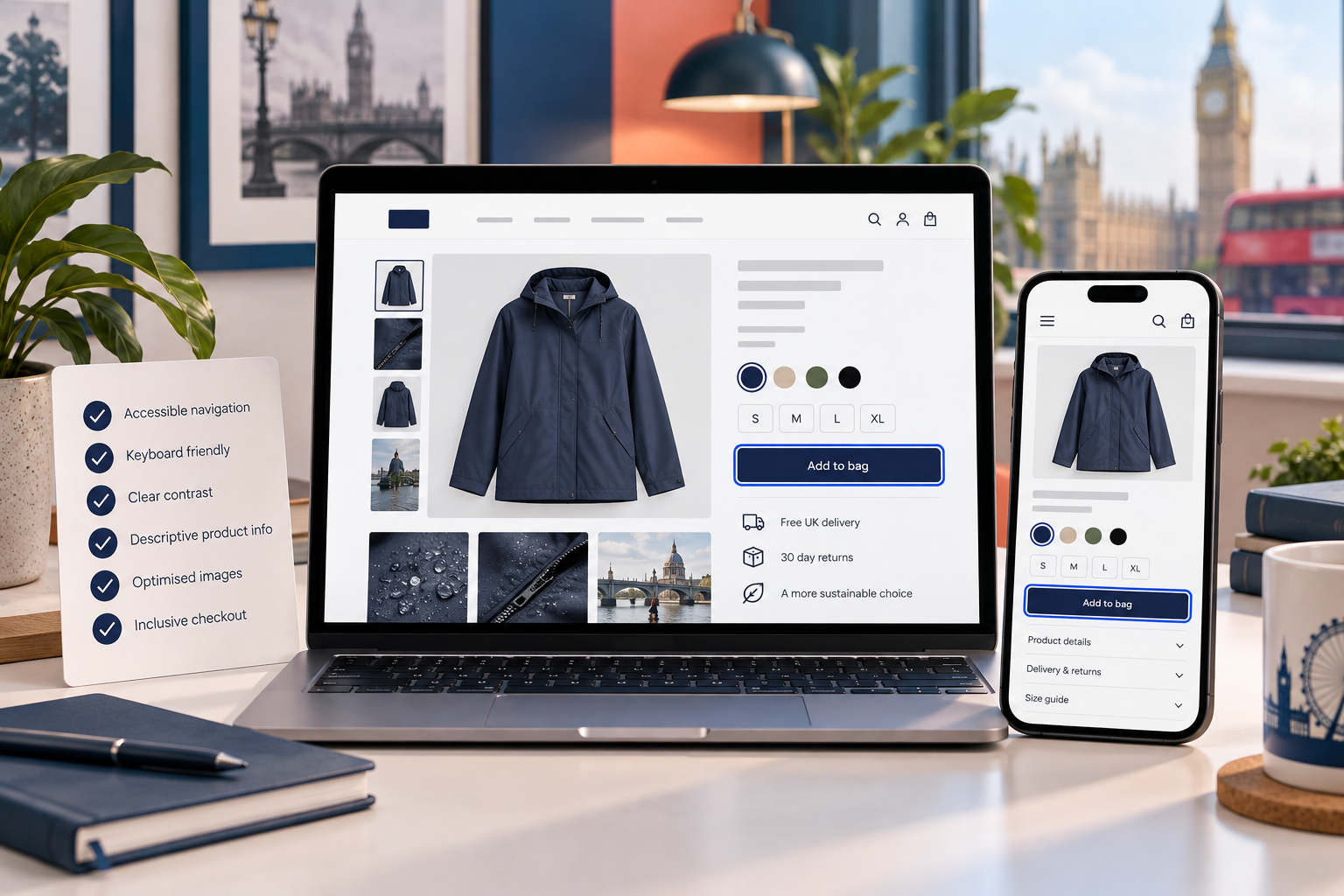
What we have seen is this: category pages are often treated as an inventory shelf, even though they are where a large share of shoppers decide whether a brand understands the job they are trying to do. For a UK ecommerce team, a Shopify collection page has to make a range feel navigable on a small screen, answer delivery and availability questions early, and still leave enough room for distinctive merchandising.
Explore Shopify CRO and UX optimisation.
Table of contents
- Keyword decision
- Start with the shopper decision
- Build a useful collection structure
- Make filtering earn its place
- Treat product cards as decision tools
- Merchandise without misleading
- Measure the category, not just the checkout
- StoreBuilt point of view
Keyword decision
Primary keyword: Shopify category page UX. Secondary intents include Shopify collection page design, ecommerce category-page conversion, Shopify filters and UK ecommerce merchandising. The search intent is practical commercial research: an operator has a collection template but needs it to help customers choose. It supports StoreBuilt’s CRO service rather than competing with the homepage’s agency terms.
Current UK agency libraries, including Charle’s ecommerce resources, signal demand for concrete CRO and platform advice. The gap worth addressing is not another generic “beautiful collection page” checklist. It is the operational question: which information lets a customer decide before an unnecessary product-page hop, support contact or return?
Start with the shopper decision
Name the decision before changing the template. A shopper buying skincare may be narrowing by concern and ingredients; a homeware shopper may be comparing dimensions, finish and delivery timing; a trade buyer may be checking pack size, availability and account pricing. One generic filter set cannot serve all three.
Review internal search terms, on-site filter use, customer-service questions, returns reasons and mobile session recordings where consent and tooling allow. Group collections by decision pattern, not simply the way stock happens to be imported. A collection called “New arrivals” can be an editorial browse. “Dining chairs” is a considered comparison. Their page structures should differ.
An anonymous UK home-and-lifestyle retailer had useful filters but hid dimensions until the product page. Shoppers repeatedly opened multiple tabs to compare. Bringing a consistent dimensions cue and material label into the card did not replace the product page; it removed a low-value detour.
Build a useful collection structure
Put a short, specific category promise near the product grid. It should orient the shopper, not push the products below the fold. Use subcategory links where they map to a genuine next choice, and keep breadcrumbs predictable so customers can move back without losing their context.
| Page element | Customer question answered | Implementation check |
|---|---|---|
| Category title and intro | “Am I in the right range?” | Distinct copy, not a copied manufacturer description |
| Subcategory links | “Where do I narrow next?” | Link to live, indexable, non-duplicate collections |
| Filters | “What fits my needs?” | Values are complete and use customer language |
| Product cards | “Which few should I inspect?” | Image, price, variant and availability data agree |
| Buying help | “What does this term mean?” | Size, care or delivery help opens without disrupting browse |
Avoid making the first screen a wall of SEO text. Useful category content can sit below the grid or behind a clear “buying guidance” disclosure, provided the important context remains available to people and crawlers. The goal is clarity, not word count.
Make filtering earn its place
Filters are promises. “In stock” must respect the inventory logic visible to the customer. “Colour” should not mix finishes with marketing names unless the store explains the difference. Size filters should not return products whose selected option is unavailable. Audit values with real catalogue exports before redesigning the visual layer.
On mobile, make the filter affordance obvious, preserve selected filters in the URL where appropriate and show what will be cleared. A customer who loses a carefully narrowed range after changing sort order is less likely to continue. Test keyboard use and focus management too; a polished slide-over that traps focus is not a conversion improvement.
Prefer decision filters before descriptive filters. Price, size, compatibility, availability, material and delivery suitability normally earn prominence. Seasonal tags and long tail attributes can remain secondary. Review no-result combinations monthly; they usually reveal product-data gaps or misleading options.
Treat product cards as decision tools
A card is not a miniature product page. It is an invitation to inspect the right product. Use consistent image crops, a recognisable product name, price presentation that handles sale rules honestly, and one or two attributes that reduce comparison effort. Do not cram every badge, review, payment method and promo into a card until the products become indistinguishable tiles.
UK ecommerce teams should be especially cautious around stock and delivery claims. If “despatches in 24 hours” depends on a warehouse cut-off, state the condition or use a calmer verified message. If a product has material option differences, ensure swatches update the correct image and do not imply an unavailable variant can be purchased.
Merchandise without misleading
Merchandising should help a shopper make a better choice, not merely force a campaign priority. Pinning a product can make sense for a starter option, a seasonal hero or a high-margin bundle, but only if relevance remains intact. Separate manual collection ordering from automated rules and document the owner who changes each.
Useful interventions include an edited “best for small spaces” rail, a compatible-accessories block, or a buying-guide link for complex ranges. Test them against product discovery and contribution margin, not just clicks. A module that wins clicks but sends shoppers to a poorly stocked product can damage trust.
Ask StoreBuilt to review your Shopify collection-page journey.
Measure the category, not just the checkout
Track collection-to-product click-through, filter engagement, zero-result states, product-page return rate, add-to-cart rate and revenue per collection session. Segment mobile and desktop, new and returning visitors, and meaningful campaign landing pages. A high conversion rate on a category may simply mean the least certain shoppers left before the metric counted them.
Pair quantitative data with a regular human review: test a five-product comparison on a phone, with a keyboard, and on a slow connection. Check the category after new stock or a merchandising import. The most expensive collection bugs are often ordinary data mismatches that no design review catches.
StoreBuilt point of view
The best category page does not make every product look equally important. It makes the next sensible choice easier. We think a Shopify collection template should be governed like a product decision system: trustworthy data, a small number of useful controls and merchandising that can explain itself. When those foundations are right, visual refinement starts to compound instead of masking friction.
A 30-day category-page improvement cycle
In week one, export the most-used filters, the highest-exit collections, search terms that led to collection pages and the top support questions. In week two, inspect ten representative mobile journeys and validate the underlying product attributes against the storefront. In week three, ship one small change with a clear hypothesis: for example, make compatibility visible before the click, or correct a filter whose values are incomplete. In week four, compare the relevant path with the prior period and decide whether to keep, refine or reverse it.
This cadence prevents a redesign becoming a set-and-forget event. It also gives merchandisers, developers and customer service one shared way to turn evidence into a safe improvement. Keep a short change log with the collection, date, reason, screenshots and expected impact. During peak season, that log is often the quickest route to understanding why a range behaves differently from last week.
Finally, test the exceptions deliberately: a single-result filter, a category with no stock, a product with many variants and a customer returning from a product page. Those states reveal whether the page is genuinely helping a decision or simply looking polished when everything is ideal.