
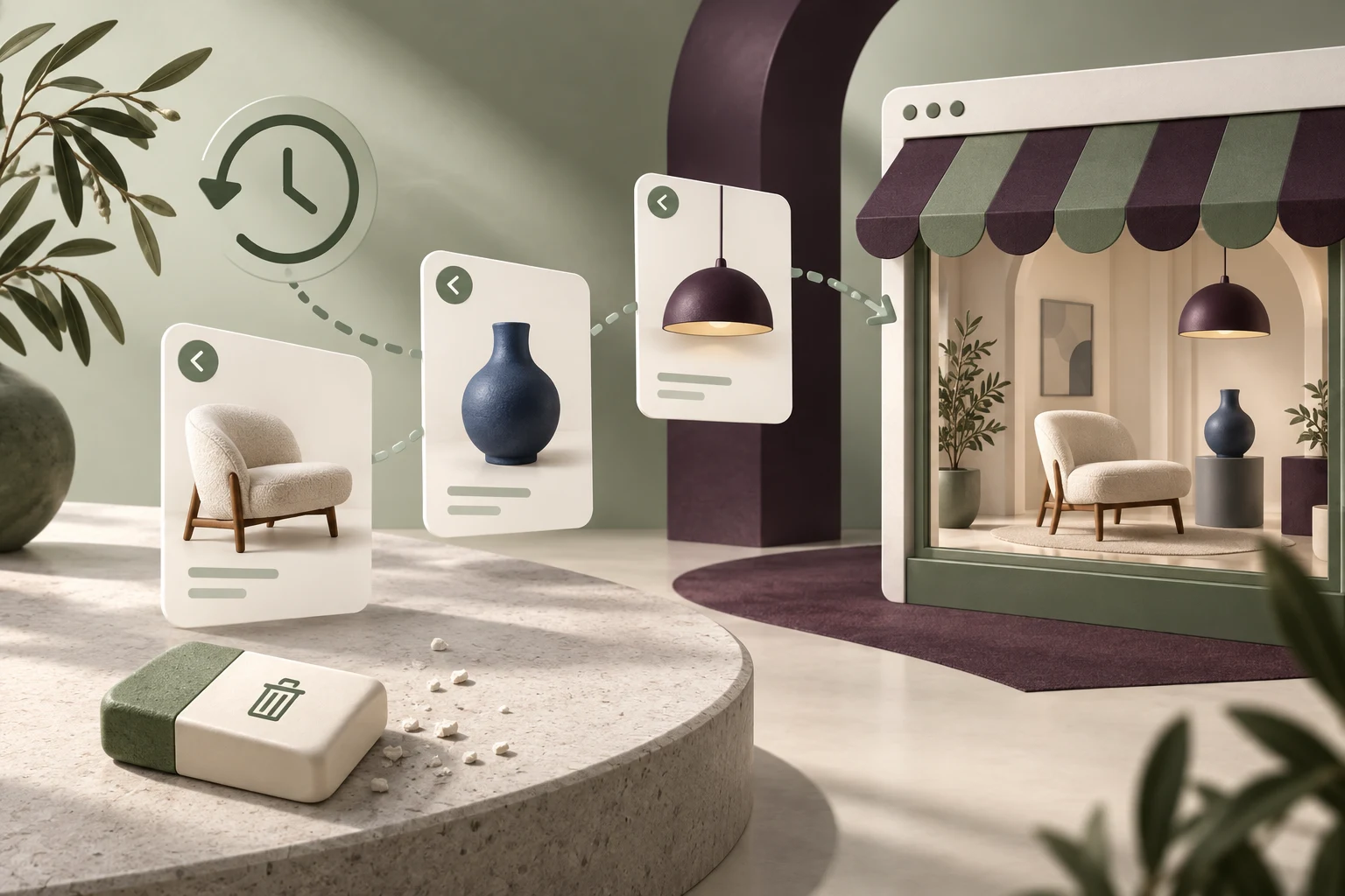
StoreBuilt reviewed public query results for recently viewed Shopify products and the ICO’s current storage guidance while preparing this guide. The feature is often discussed as an installation task, but the useful product decision comes earlier: does the customer need help retrieving something they already explored, and what exactly should the store remember?
Shopify recently viewed products can be helpful for considered purchases, especially when several similar items are compared over a browsing session. They can also add noise, stale information and unnecessary scripts when the buying journey does not need them. This guide sets out an evaluation and acceptance process for UK ecommerce teams. Examples are illustrative, and the storage discussion is implementation guidance rather than legal advice.
Contact StoreBuilt to assess whether browsing-history retrieval belongs in your store’s product journey.
Table of contents
- Start with the retrieval problem
- Keep history distinct from recommendations
- Choose the scope of memory
- Review storage according to its purpose
- Render current product truth
- Test a considered-purchase journey
- Keep the component lightweight and usable
- StoreBuilt point of view
Start with the retrieval problem
Ask shoppers to find an item they viewed earlier without telling them where to click. Observe whether they use the browser back button, repeat a collection search, remember the product name or give up. The feature has a stronger case when that repeated work is visible.
A furniture shopper comparing several chairs may benefit from a short history row. Someone buying a familiar single-product refill may gain little from it. Segment the problem by buying task rather than assuming every ecommerce store needs the same merchandising component.
| Buying situation | Potential retrieval value | Main design concern |
|---|---|---|
| Several similar chairs | return to a shortlist | distinguish finishes clearly |
| Occasional gift shopping | recover an earlier idea | shared-device expectations |
| Routine single-item reorder | possibly limited | unnecessary interface weight |
| Large replacement-parts catalogue | find a previously checked item | preserve exact product identity |
| One-product landing page | often limited | duplication without useful choice |
Write a success statement before selecting a tool: “A shopper can reopen the chair they inspected earlier without repeating the collection journey.” That is more useful than “Add personalisation to the product page”.
Keep history distinct from recommendations
Recently viewed content answers “Where was that item?” Recommendations answer “What else might suit me?” Mixing the two under one heading makes the component harder to understand. A customer may assume a suggested item was something they already checked for compatibility.
Use a plain label and preserve a predictable order. Most-recent-first is an understandable starting point, but define how repeat visits affect the list. Avoid filling the row with the same product several times just because a shopper compared its variants.
Consider whether the current product should be excluded. Showing it again below its own page usually contributes little to retrieval. Keep recommendation logic and browsing history separately configurable so the team can assess their jobs independently. The existing Shopify wishlist guide covers deliberate saving; passive browsing history should not pretend that every viewed item was intentionally shortlisted.
Choose the scope of memory
Decide whether history lasts for a page journey, a browser session, a longer browser period or an authenticated account. Those choices change customer expectations, technical scope and review requirements. “Remember my products” is too vague to serve as a specification.
A browser-local feature does not automatically follow someone to their phone or another computer. An account-based version needs ownership, sign-out and account-switching rules. Make the actual behaviour clear instead of suggesting seamless persistence that the implementation does not provide.
Keep the record as small as the feature needs. A bounded set of product identifiers may be sufficient for retrieval; storing entire rendered product cards encourages stale content. Agree a retention policy and a reset behaviour with the responsible owners. Document how the component behaves when storage is unavailable, restricted or cleared, so the page still works without a usable history.
Review storage according to its purpose
The ICO’s current storage and access guidance should inform the privacy review. Its explanation of web storage makes clear that local and session storage sit within the relevant technology landscape. Calling a feature “cookieless” does not settle its requirements.
Map what the implementation stores, when it reads the data, whether it sends anything to a provider and what each purpose is. Ask the privacy owner to establish the applicable requirements and any consent or exception basis. Do not assume a decision made for an analytics tool automatically covers a history widget.
Turn that decision into test cases. Check the initial visit, accepted and declined choices where relevant, withdrawal and reset. The component should respond to those states in the way the reviewed design requires, rather than displaying an empty broken container when a dependency is unavailable.
Render current product truth
History should help retrieve a product, not preserve an old commercial snapshot. When the row is displayed, use current information for the relevant storefront context. A remembered sale price from last week should not appear as if it were still the offer.
Define what happens when a product is unpublished, removed or unavailable in the active market. Hiding an inaccessible record may be appropriate; an unavailable product that remains useful for reference may warrant a clearly labelled route. The right choice depends on the catalogue, but a broken link is not an intentional policy.
For variants, decide whether history remembers the product or the precise selection. If a customer viewed a blue chair, reopening a generic chair page with a different default finish can feel like the wrong item. Either preserve the selection reliably or make the card’s scope clear so the visual does not overpromise.
Test a considered-purchase journey
Imagine an illustrative interiors shopper comparing a green dining chair, a blue armchair and a pendant light. They return to the collection grid and later want the green chair again. A small history row with recognisable imagery and accurate names can shorten that retrieval task.
Now change the context. Another person uses the same device, or the shopper changes the delivery market. Does the feature expose an unexpected history or display an unavailable item? The purpose of these tests is to reveal the assumptions hidden in an apparently simple carousel.
Provide an understandable way to clear history where the design calls for persistent recall. Check the resulting empty state and whether new browsing begins a fresh list. A control that changes the screen but leaves the underlying stored history ready to reappear is not a completed reset.
Keep the component lightweight and usable
A retrieval aid should not delay the main product information. Compare the page before and after installation, including image requests, script behaviour and layout movement. Avoid making the primary buying controls wait for a secondary history row to initialise.
On mobile, make product names, prices and navigation reachable without precision gestures. If the row scrolls horizontally, test keyboard access and clear controls where needed. Do not rely on hover to expose the only useful action.
| Scenario | Expected behaviour | Evidence |
|---|---|---|
| First visit | no misleading history | clean-browser check |
| Repeated product visit | deliberate ordering and deduplication | recorded sequence |
| Product removed | no broken purchase route | changed-catalogue check |
| Market changed | current relevant information | market comparison |
| History cleared | previous items stay cleared | reload and revisit |
| Storage unavailable | main page remains usable | restricted-state test |
Test the actual app or theme component rather than accepting a feature-list promise. Record the settings and version used for the review so future changes can be compared with a known behaviour.
StoreBuilt point of view
Recently viewed products should earn space by saving the shopper real work. StoreBuilt would start with evidence of a retrieval problem, then implement the smallest understandable memory that solves it. More remembered data and more carousels are not the same as a better buying journey.
Use the Shopify product discovery audit to assess the wider journey. For implementation, explore Shopify design and development or Contact StoreBuilt with the task your shoppers struggle to repeat.